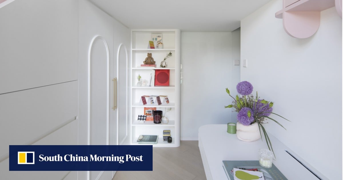
Recalling her own formative years at a time when children rarely had a say, Eva says: “We wanted to show them that their voice was heard.”
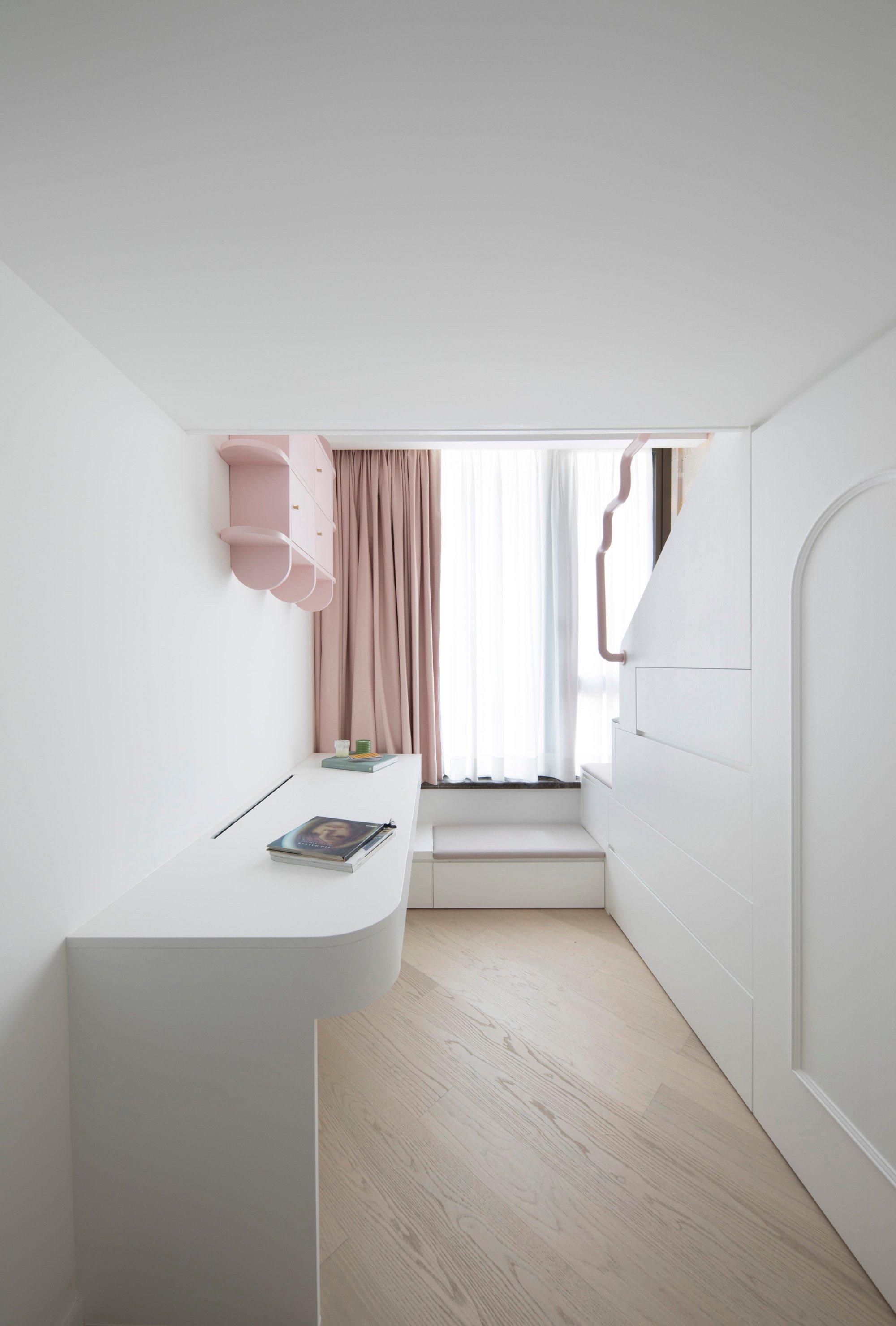
Chill Interior Design founder Ronald Cheung Cheuk-man’s inspiration for the girls’ “fun play space” came from a number of sources, including the Barbie Dreamhouse.
Each iteration of the world’s bestselling dollhouse released since 1962 has reflected a desire “for whimsy and escapism”, according to a 2022 book titled Barbie Dreamhouse.
Published by toymaker Mattel, it notes that, over time, the architecture and design of the dollhouse charts the evolution of the suburban American home.
Taking advantage of the room’s higher-than-normal ceiling, Cheung proposed an outsize platform bed accessed by a staircase trimmed with a whimsical detail (see Tried + tested below).
Below the platform is a desk for two and, under the stairs, deep storage drawers, plus hers ’n’ hers wardrobes fashioned in a graceful arch. One wall is covered with animal-print wallpaper; another has a whiteboard finish on which the girls can draw freely.
Pink, of course, is the dominant colour theme.
In later years, should the girls prefer separate beds, Cheung says the fixtures can be removed easily and the room reconfigured.
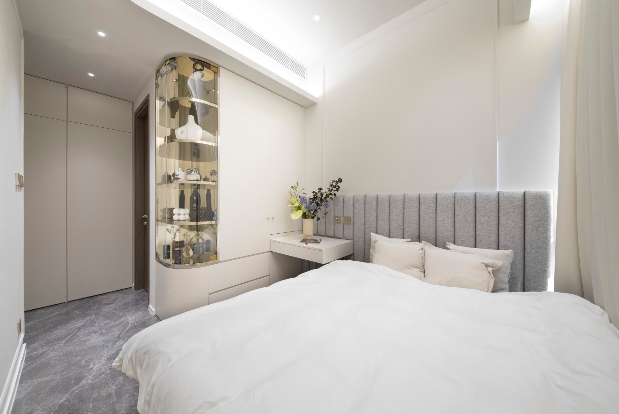
Modifying the door to the parents’ bedroom, and pushing their bed to one side of the room, enabled Cheung to incorporate additional wardrobes and drawers, a built-in desk and, at the end, a curved glass cabinet to display Eva’s collection of designer handbags, when they are eventually unpacked.
Cheung says fabricating and fitting this showcase, with a mirror-finish stainless-steel back to show all sides of the items inside, was one of the most challenging parts of the renovation.
“It had to be made, transported and installed in one piece, being careful to avoid scratches,” he says.
With feng shui important to the family, avoiding sharp corners makes the smallish bedroom feel more inviting and harmonious, says Cheung.
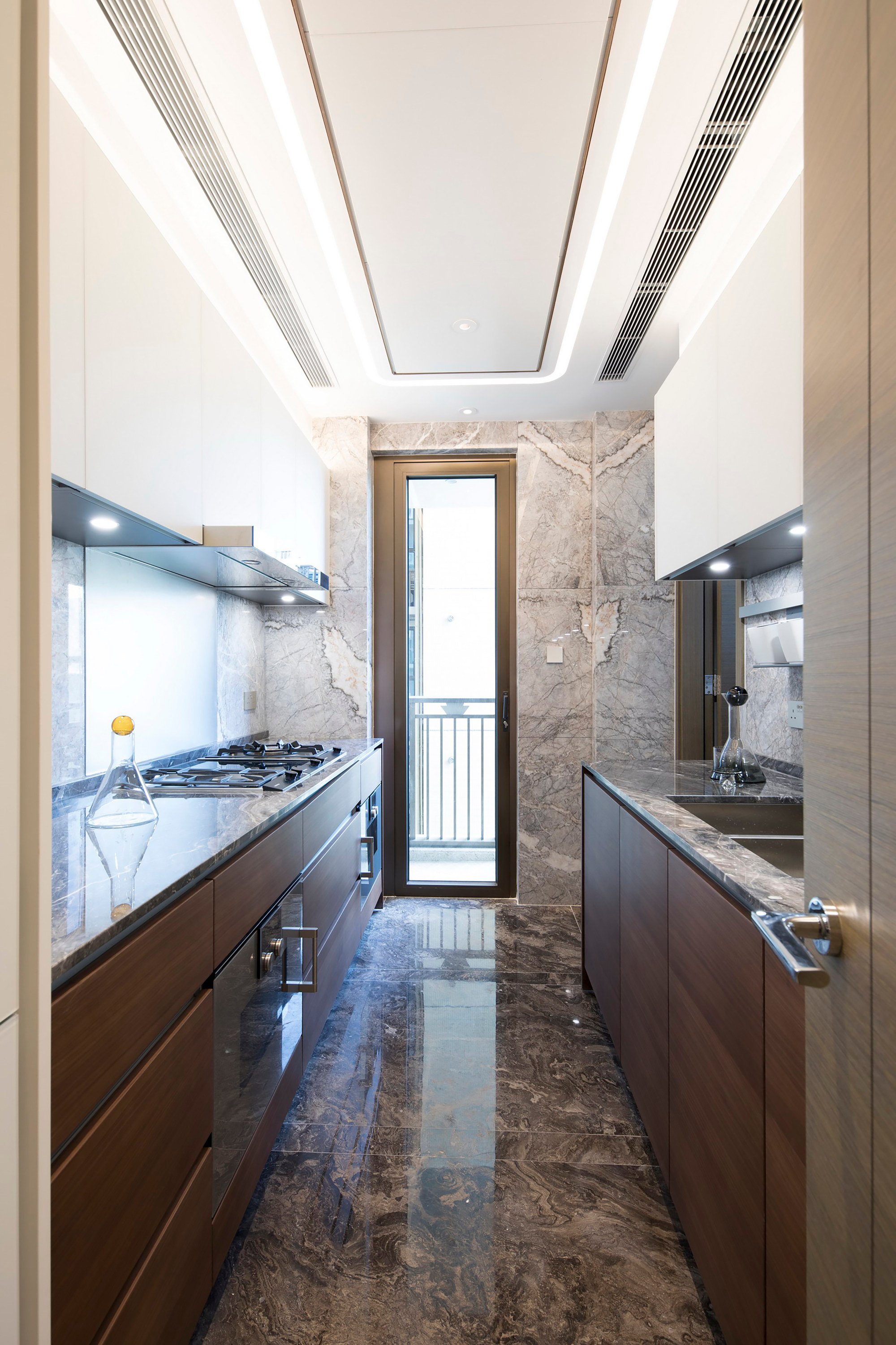
The engineered-timber flooring in the developer’s fitout was not to the couple’s liking, so was replaced in the living and dining areas with polished marble.
It’s simple but elegant; not overly extravagant
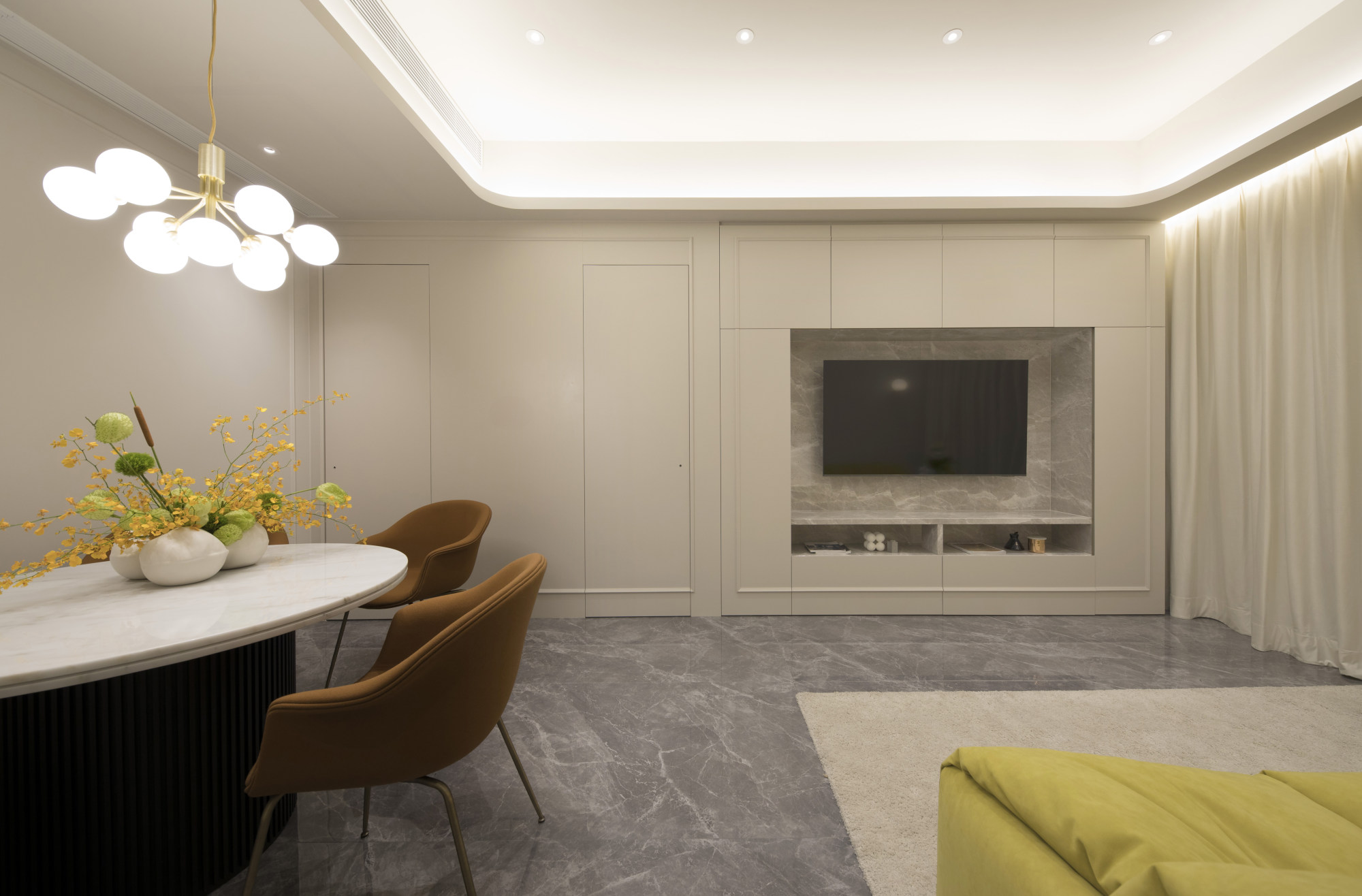
To further fancify this social zone, Cheung sculpted a recessed ceiling with rounded edges, creating a cavity for concealed lighting, which bathes the space in an ambient glow.
With extra storage a requirement of the owners, he added a false wall in the living area extending 40cm (16 inches) deep from the original wall. Providing semi-concealed cabinetry from floor to ceiling, this joinery incorporates a television niche and blends into the decor courtesy of the dainty timber mouldings used consistently throughout the living and dining area.
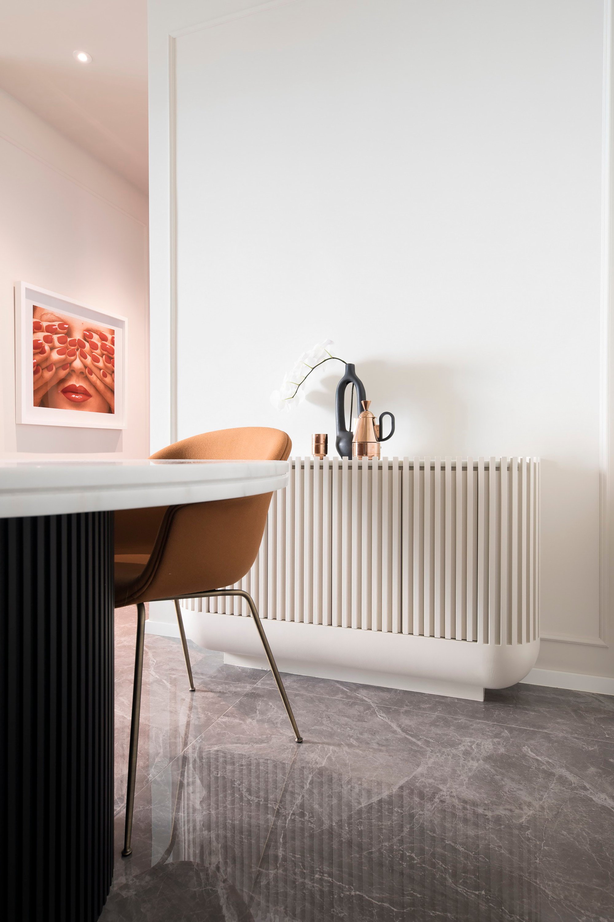
For this space, Cheung also designed a dining table and buffet that were paired with Gubi chairs and a Ligne Roset sofa. Inside the round base of the marble-topped table, he concealed additional storage.
The couple wanted a comfortable and inviting home that “feels just right when you walk in”. They believe Cheung delivered “perfectly”.
“It’s simple but elegant; not overly extravagant,” says Eva.
Adds Patrick: “Ronald let us express our ideas, but used his professional judgment to steer us in the right direction.”
Girls’ room
The Barbie-inspired girls’ bedroom, dreamed up by Ronald Cheung Cheuk-man, founder of Chill Interior Design (chillinteriordesign.com), is both playful and practical.
On one side are wardrobes and drawers built into the staircase; on the other is a two-person desk with a whiteboard wall behind it. In between is a custom bookcase.
Girls’ room detail
The girls’ shared platform bed contains a mattress and reading/play area. Added for comfort and safety are a full-height upholstered headboard and pink Perspex guard rail.
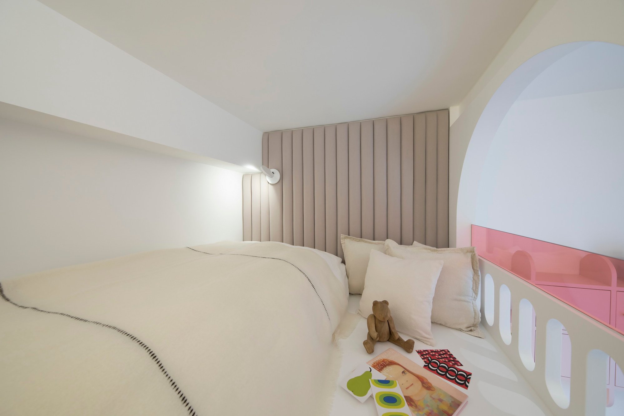
The reading lamp was from Artemide (artemide.com) and the cushions and bedlinen came from Kvadrat (kvadrat.dk).
The design of the girls’ bedroom optimises storage – even in the step leading to the staircase. The pink curtains were made by House Fashion Curtain (87 Wan Tau Street, Tai Po, tel: 2651 8854).
Engineered flooring provided in the developer’s fitout is laid in an angular pattern. The cubby drawers on the wall were custom made by Chill Interior Design.
Dining area
Decorative items on the buffet, designed by Chill Interior Design, came from Tom Dixon (tomdixon.net). The framed photograph in the corridor to the girls’ room is a Guy Bourdin print from AP8 (ap8.art).
Living and dining area
Alterations to the living area – a new tray ceiling plus a false wall accommodating storage space, a television niche and doorway to the main bedroom – were designed and completed by Chill Interior Design.
The marble for the flooring was sourced in mainland China. The Ligne Roset sofa (ligne-roset.com) is complemented by a rug from Ikea (ikea.com.hk).
The Chill-designed custom-made dining table is paired with Gubi chairs from Nest (nest.co.uk), which was also the source for the Nuura light fitting. The Completedworks vases came from Farfetch (farfetch.com).
Main en suite bathroom
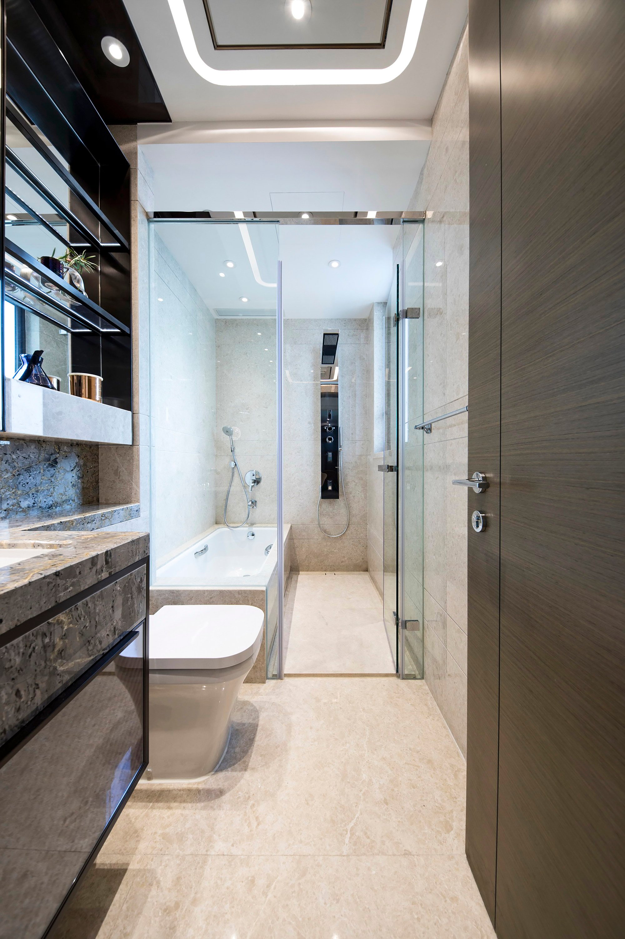
The marble-finish en suite bathroom provided in the developer’s fitout was adequate for the owners’ needs, so was not altered in the renovation.
Main bedroom
A curved-glass display case wraps around a newly added wardrobe in the parents’ bedroom. This unit, the small desk-cum-bedside table and bed were designed and built by Chill Interior Design. The headboard is upholstered in fabric from Kvadrat.
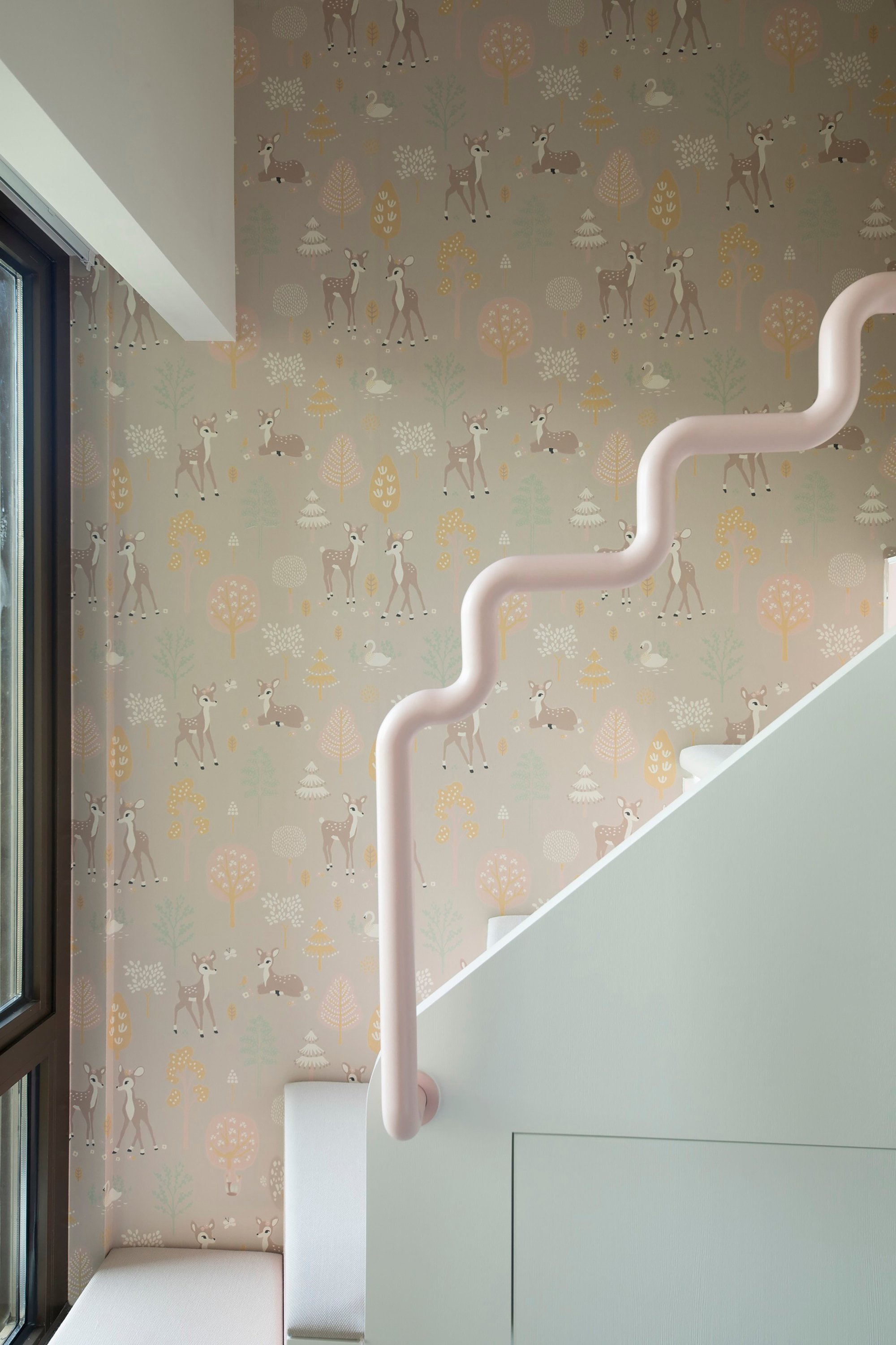
Tried + tested
A pink powder-coated metal handrail curving upwards to the platform bed adds a whimsical detail to the girls’ room. It was designed and made by Chill Interior Design.
The animal-themed wallpaper behind it is by Swedish brand Majvillan from Tat Ming Wallpaper (tatming.com).

