Although the property had been in his family for years, he had never lived there and wanted to make it his own.
The challenge is how to create a level of personality, striking the right balance between aesthetics and functionality
Unchanged since the 1990s, the apartment featured overpowering brown marble bathrooms and a claustrophobic, old-fashioned kitchen.
The layout was determined by structural walls, drainage locations and the requirement to retain the three original bedrooms for future resale value.
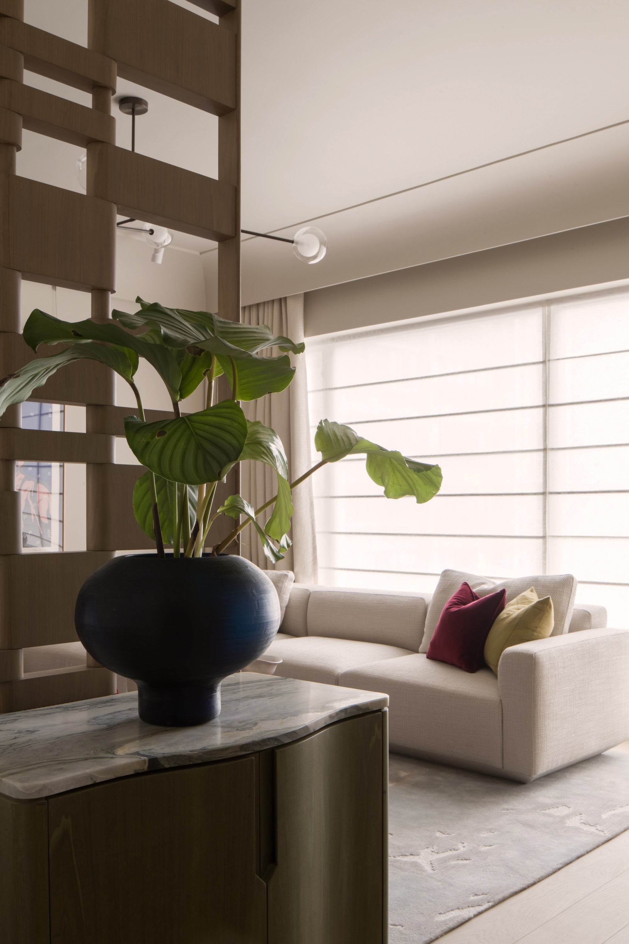
Although Bridgland stripped the interior down to its bare bones, she worked with the restraints and replanned the division, function and arrangement of the spaces rather than change the entire floor plan.
“High-rise, residential-tower typologies are ubiquitous in Hong Kong and the challenge is how to work with the often standardised modular framework to create a level of personality, striking the right balance between aesthetics and functionality,” says Bridgland, who worked for design mavens Tom Dixon, Sophie Ashby and Joyce Wang before setting up Studio Ella in Hong Kong in 2022.
Establishing a clear design language was crucial. While the flat bears all the hallmarks of a chic urban pad, with an energetic feel that communicates her client’s lifestyle, it is also comfortable and inviting.
Soothing avocado green, French simplicity in this Hong Kong home’s makeover
Soothing avocado green, French simplicity in this Hong Kong home’s makeover
The use of mixed textures and tactility expresses an earthy, calming aesthetic, a connection to nature that makes the apartment feel like a retreat, despite having the city on its doorstep.
“A thoughtful use of materials plays a key role in all of our projects,” says Bridgland. “We used raw silk wallpaper on walls and wardrobes alongside slick nickel accents as one way of reflecting the contrast between the city and nature.
“Gouged timber drawer fronts to the bedside tables also add tactility and the feeling that the surface has weathered over time, which is complemented with more luxurious velvet soft furnishings and rugs.”
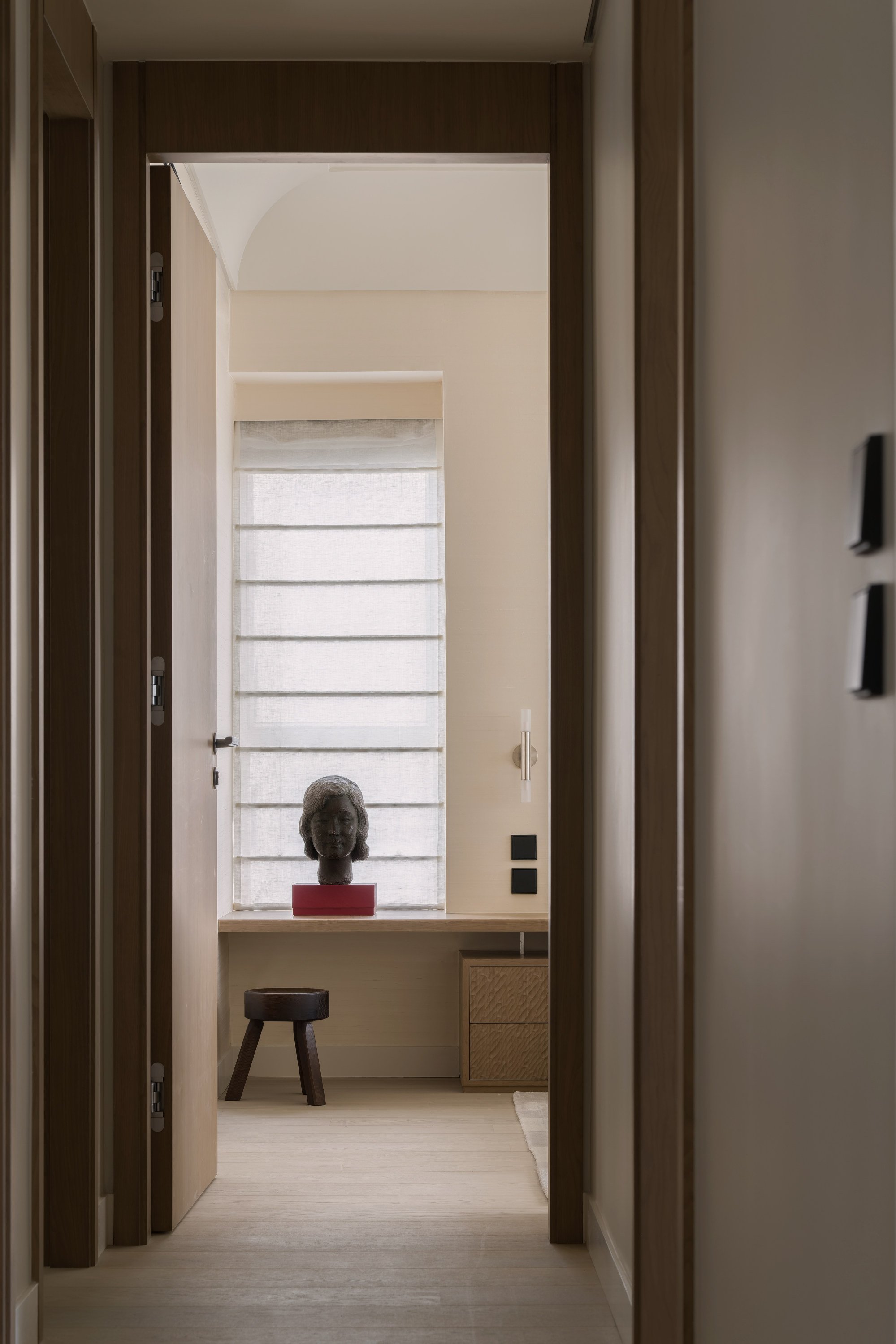
Bridgland also worked with her client’s feng shui master and incorporated various principles into her design. Among other things, the perforated screen near the entrance ensures positive energy is not blocked and the softened corners in the main bedroom avoid energy drain.
“We also established a refined material palette for a feeling of continuity throughout, focusing on texture against a muted backdrop to achieve a timelessness and apparent simplicity,” she says.
Quality was the driving factor behind the design.
To make the apartment look and feel more special, a sizeable chunk of the budget was directed towards the architectural finishes and luxurious fixtures, such as the phoenix marble in the main bathroom, whose patterned veins suggest the movement of wind.
The muted backdrop allows for bolder colour and patterns to be introduced through soft furnishings and artwork to refresh the space if and when desired
“My client is very informed about aesthetics and it was important to him to have an international feel,” says Bridgland.
“As the flat has high ceilings, I was able to celebrate that by installing oversized cornices – a subtle, elegant take on a European reference that elevates and frames the space, giving it a sense of grandeur.”
Also paramount was the need for decor that would stand the test of time, so Bridgland used a soft, neutral palette with soothing colour accents, notably a rich burgundy in the living room and understated blues and greens elsewhere.
In response to the client’s lifestyle and current requirements, she turned one of the smaller bedrooms into a study and repurposed the other as a dressing room that can also accommodate guests.
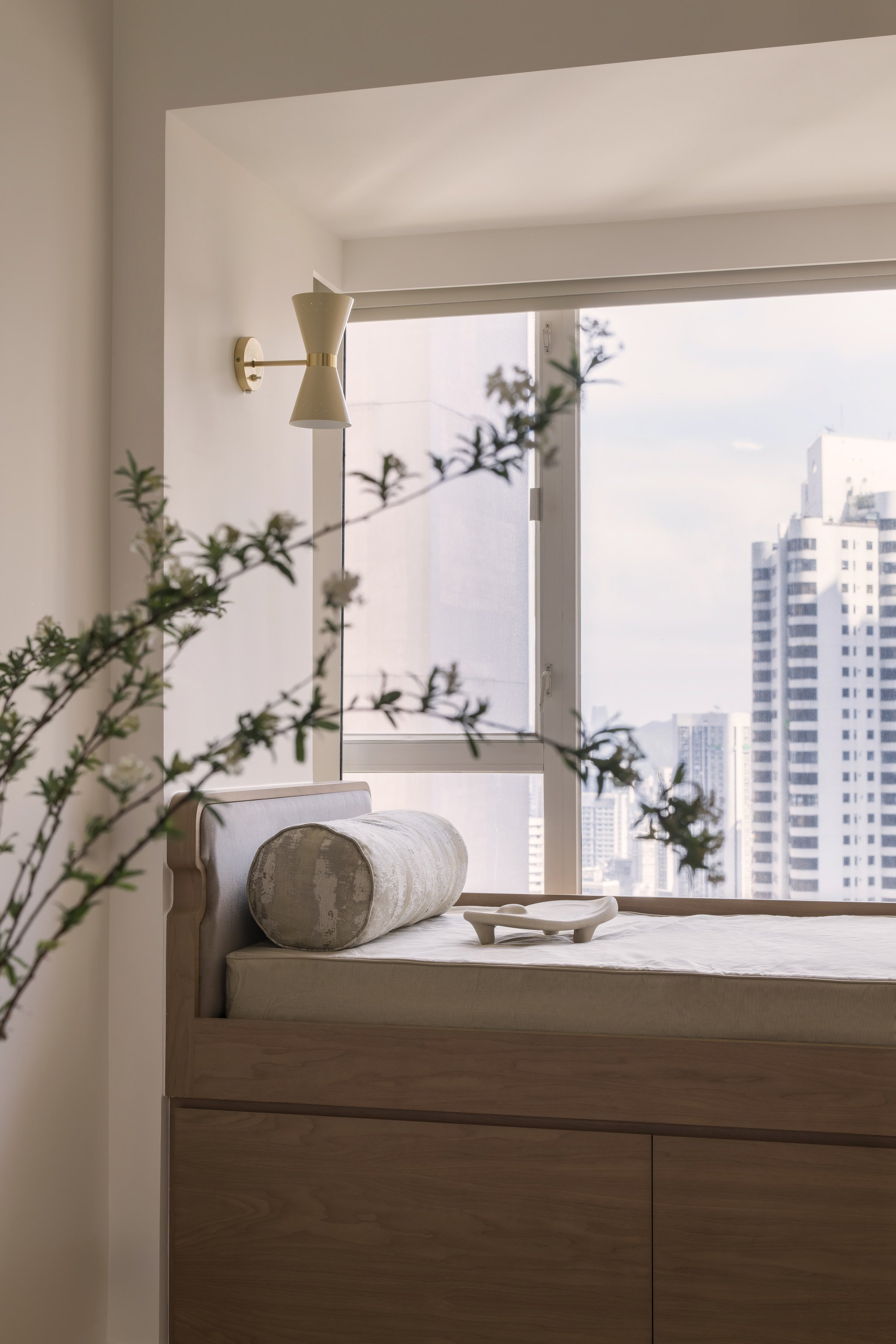
In the latter, she built a day bed over a deep bay window ledge, with storage beneath it to maximise the usage of space and to optimise views.
“It was important that the apartment would remain relevant and evolve with my client as he reached different life stages rather than needing to be re-renovated,” explains Bridgland, who took 10 months to complete the project.
“For example, the muted backdrop allows for bolder colour and patterns to be introduced through soft furnishings and artwork to refresh the space if and when desired; the study and dressing areas can be easily transformed back into bedrooms.”
For now, her client, who moved in earlier this year, has a place to relax and unwind after long hours in the office and can also entertain his friends in style.
“This apartment is a microcosm of Hong Kong itself – a place where energy and serenity coexist, where the frenetic pace of business is balanced by the tranquillity of natural beauty,” says Bridgland.
The result is a home that elegantly frames this duality.
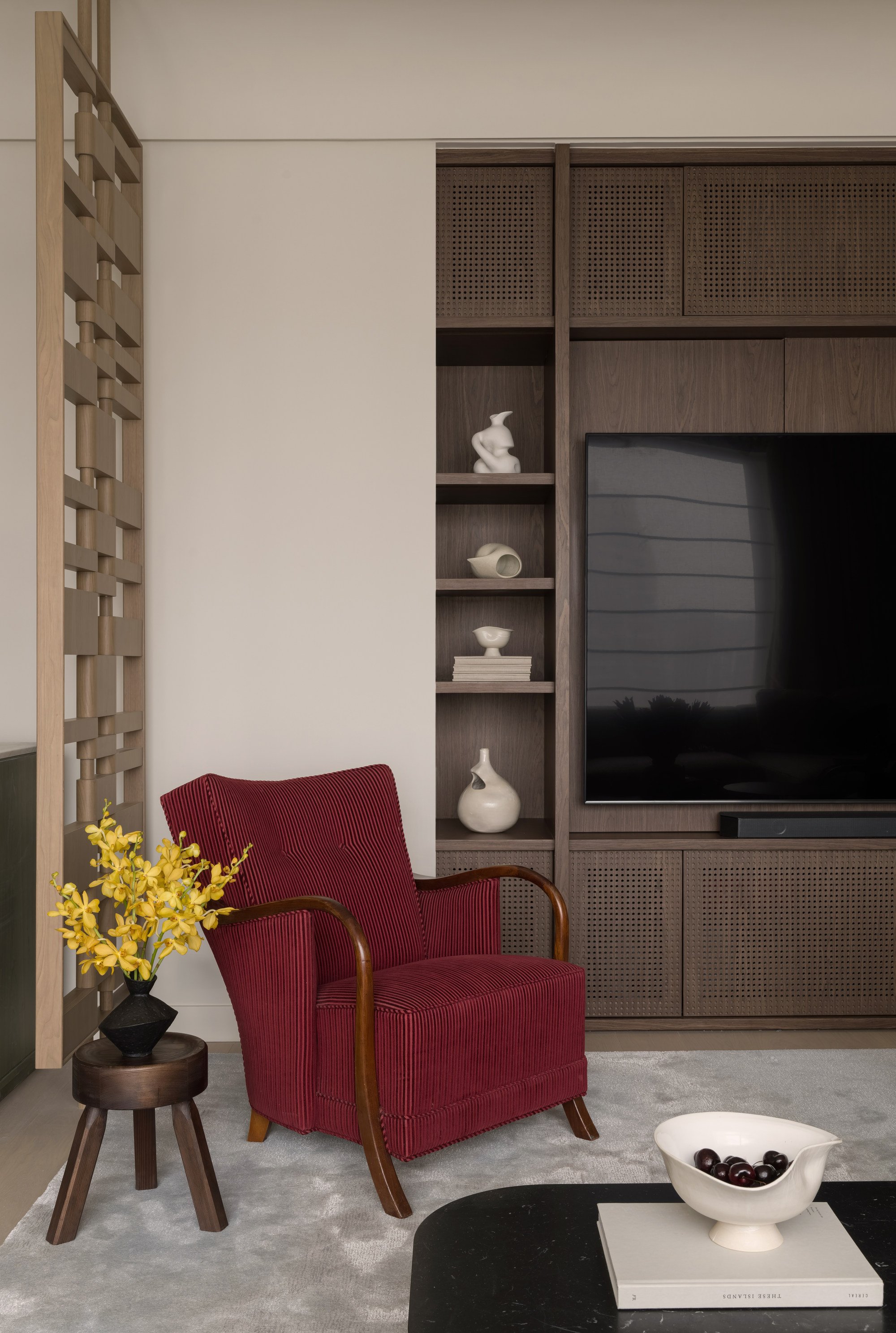
Living room
The antique burgundy armchair has been in the client’s family for years and details have been forgotten. The AML stool came from Frama (framacph.com). The Fly SC5 coffee table was sourced from &Tradition (andtradition.com) and the Oyster bowl was by Ephelis from Studio Wool (woolstudio.co).
The other ceramics came directly from Ephelis (ephelis.studio). The perforated walnut television cabinet was designed and made by Studio Ella (studioella.co).
Entrance leading to living area
A geometric wooden room divider and shoe cabinet separates the small entrance from the living room. These two pieces, along with the rug, were designed and made by Studio Ella.
The Plum planter was by Tom Dixon (tomdixon.net), the Develius sofa from &Tradition and Branch Bubble pendant light by Giffin Design.
Dining room
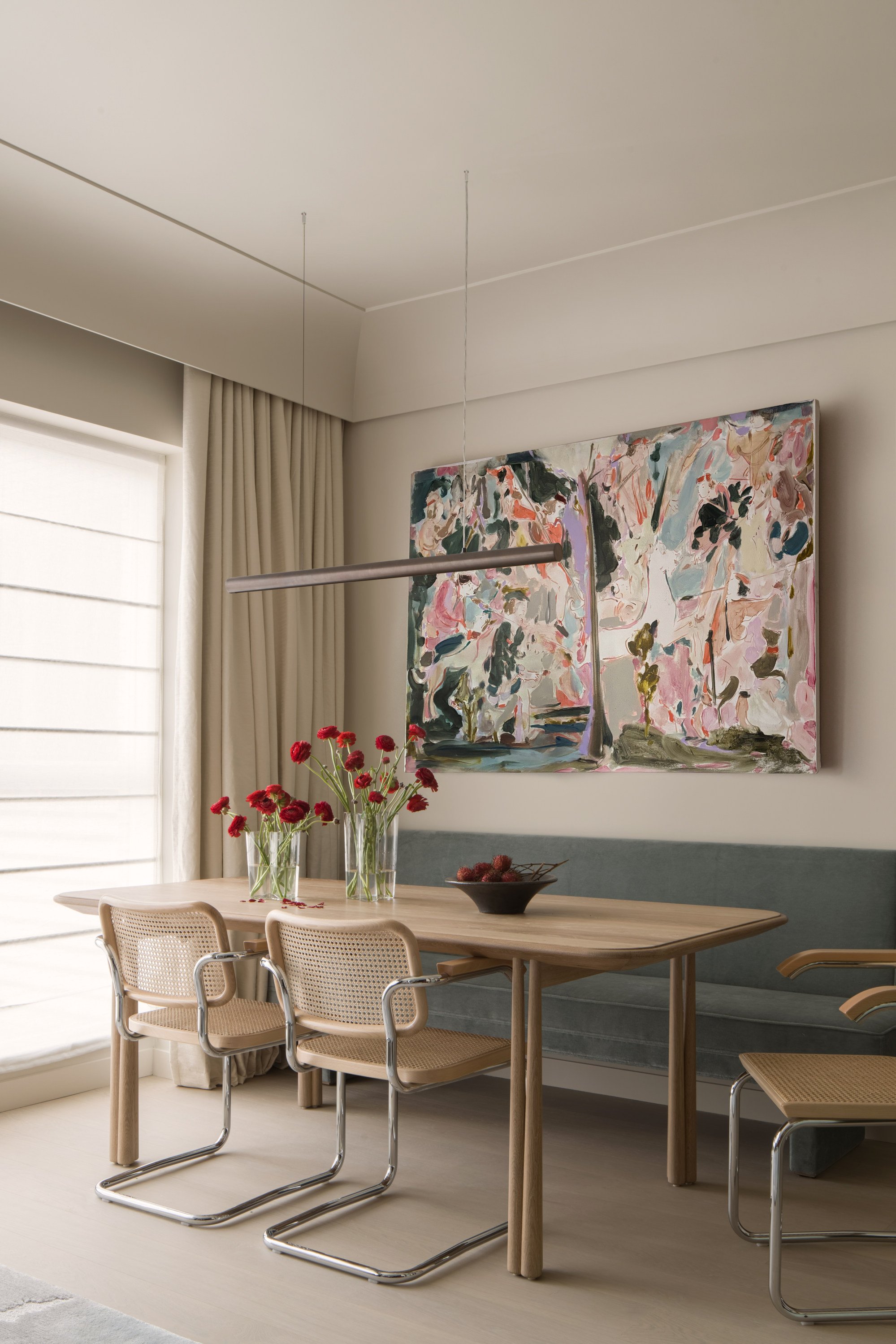
The artwork, Such (2019), by Tomo Campbell, came from Cob Gallery (cobgallery.com) and the Tube pendant light was from Giffin Design (giffindesign.com).
The Elliott dining table was by Jason Miller Studio (jasonmiller.us) and the Cesca dining chairs with cane seats were from Knoll (knoll.com). Studio Ella designed and made the velvet banquette.
Kitchen
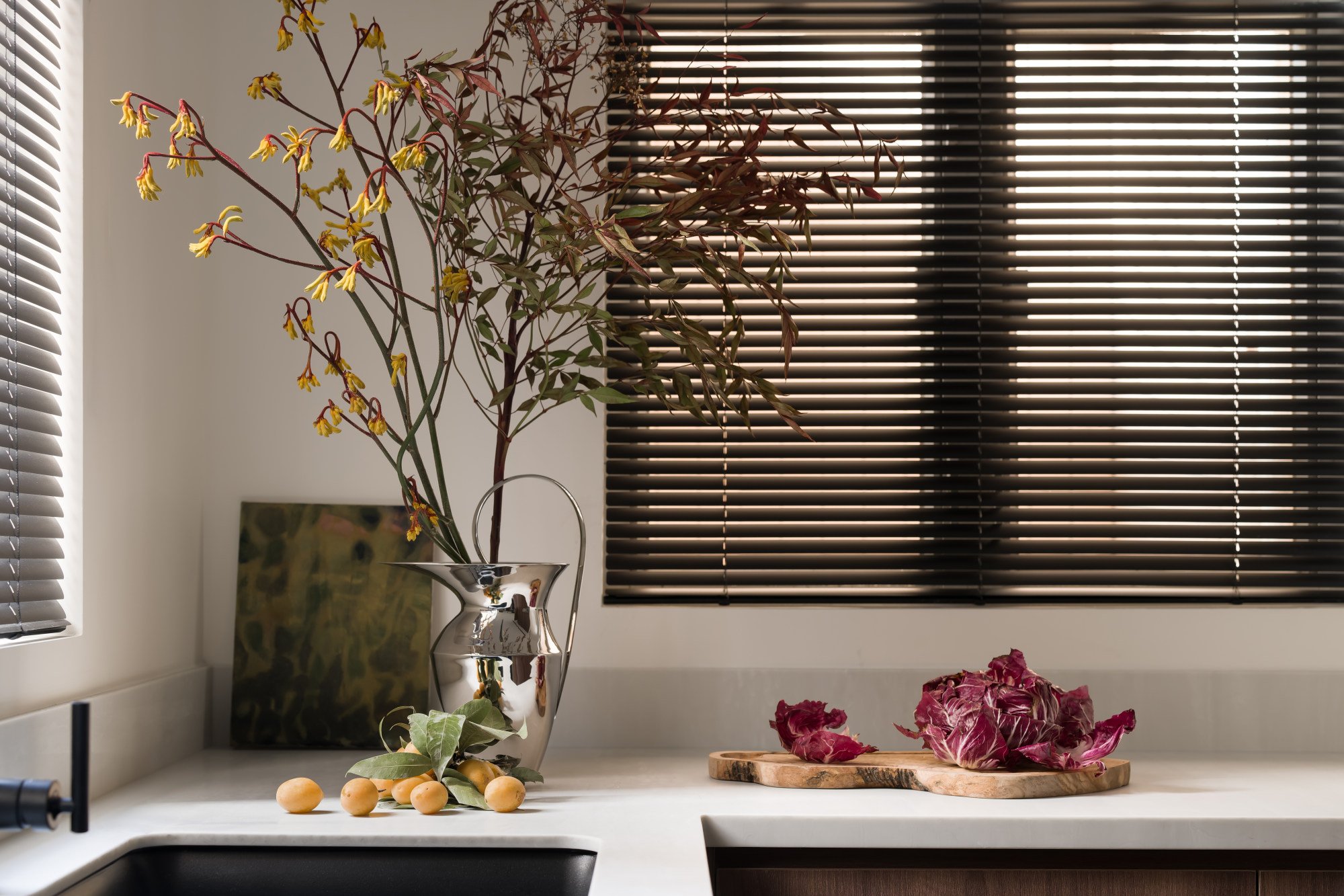
The kitchen was designed and installed by Studio Ella. The Etruscan Pitcher H33 was from Audo Copenhagen and the blinds were from Hunter Douglas (hdgallery.com.hk).
Corridor leading to main bedroom
As you walk down the corridor leading to the main bedroom, the eye is drawn to a sculpture by Hatch Area (hatcharea.com) and an AML stool from Frama.
Main bedroom
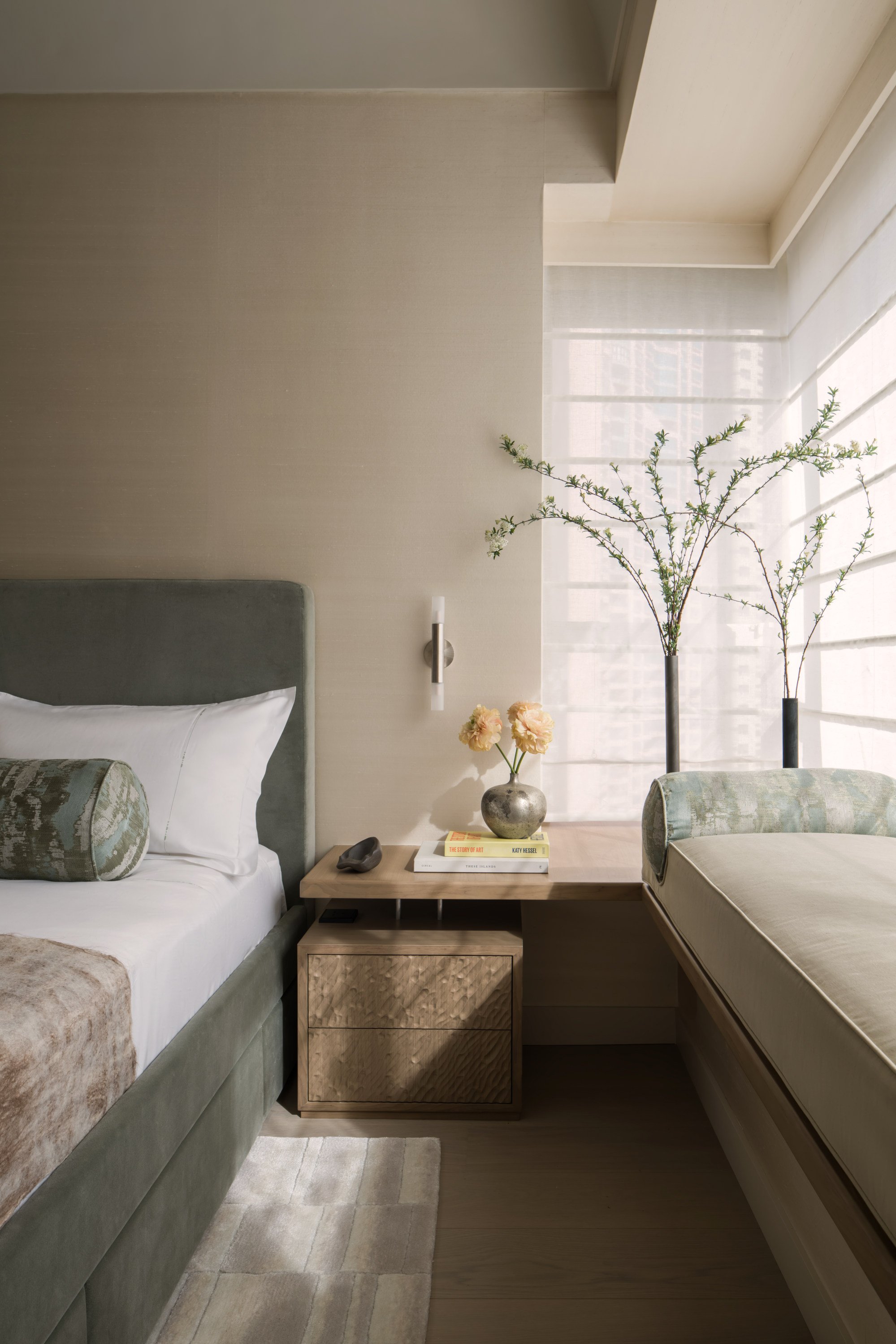
The velvet-covered bed, bedside table (which extends across to the window seat), daybed, rug and blinds were all designed and made by Studio Ella.
The antique silver vase was from Hatch Area and the tall cylindrical Stance vases were designed by Colin King for Audo Copenhagen (audocph.com). The Crown sconce was by Giffin Design.
Main bathroom
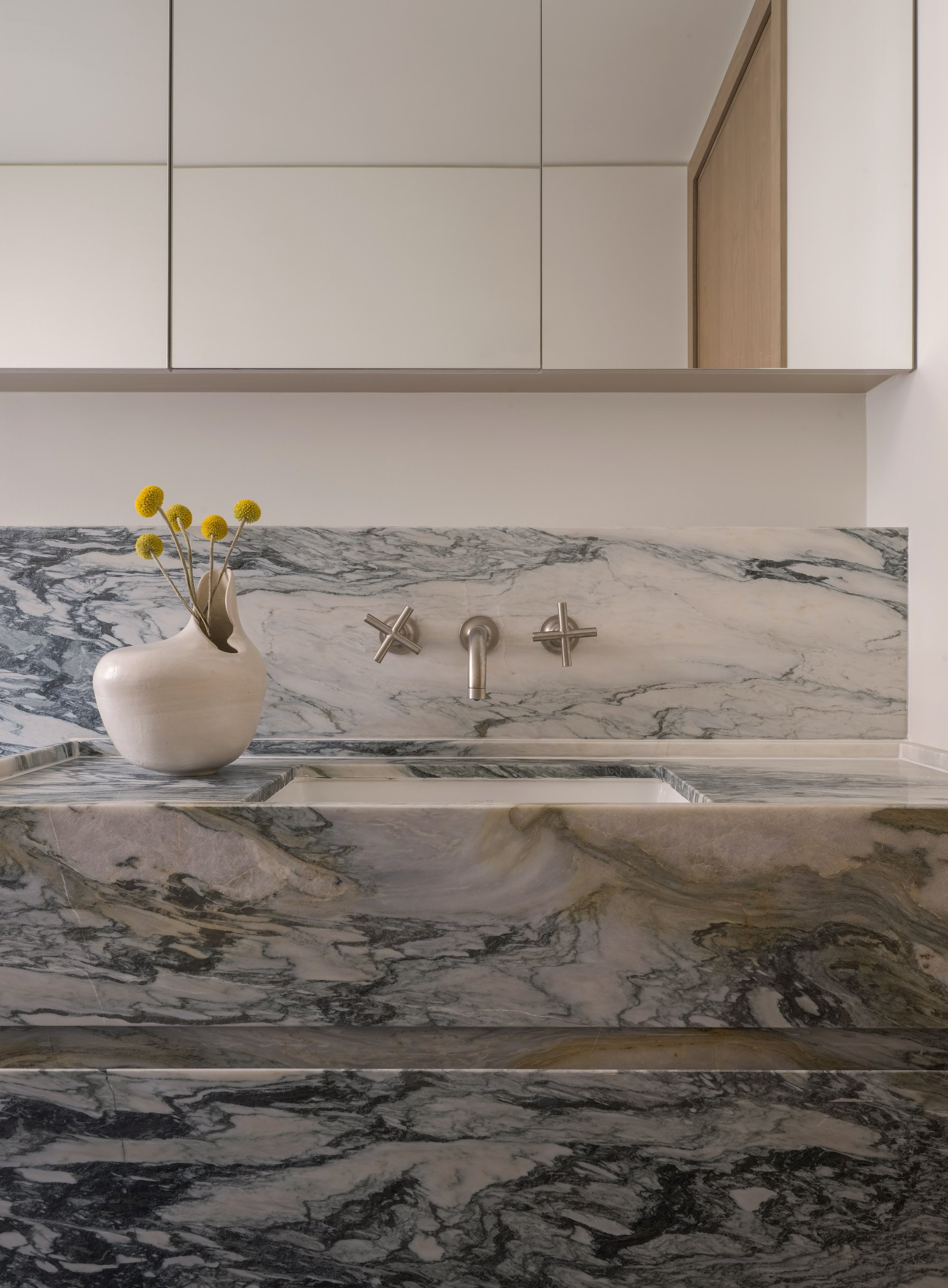
In the main en suite bathroom, Studio Ella designed and made the mirror and the phoenix marble sink unit, which has a lip around its edge to prevent toiletries rolling off. The Femme II Murex vase was from Ephelis.
Guest bathroom
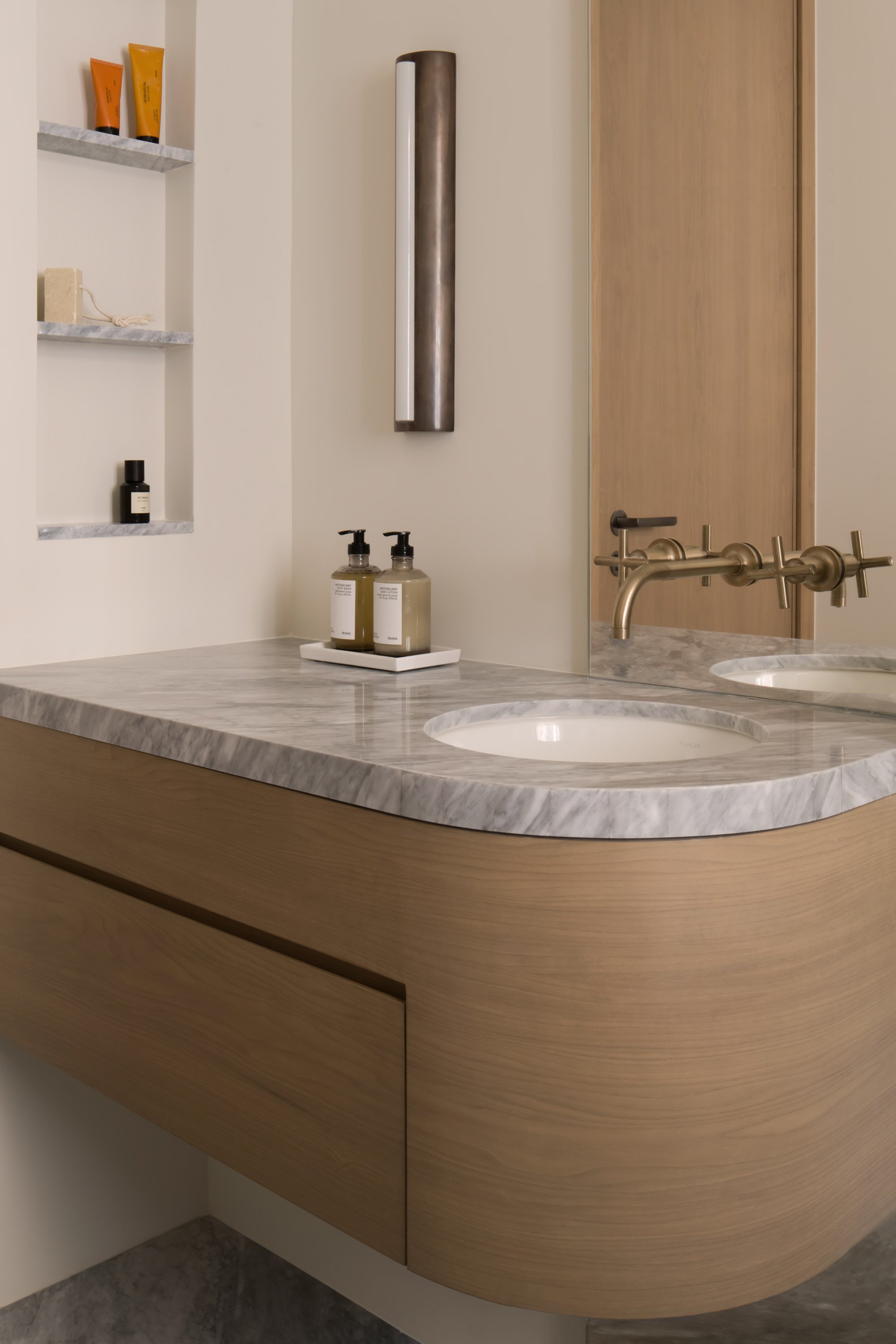
The guest bathroom features a stained-oak and marble sink unit by Studio Ella and Purist brushed-bronze taps from Kohler (kohler.com.hk). The Ralina sconce was from Giffin Design.
Tried + tested
Designer Ella Bridgland, of Studio Ella, installed vertical tracks to all edges of the window frames in the bedrooms, including the guest room, where the main and side panels of the bay windows meet.
The borders of the separate blinds slot into the tracks, thereby creating almost total blackout and avoiding annoying slivers of early-morning light.
The bed makes use of the deep bay-window space and was designed and made by Studio Ella. The Collector wall lamp came from Audo Copenhagen and the Plateau tray was from Ephelis.

