The man and his work are both difficult to place.
He finds this invisibility satisfactory.
“I want them to look at these things and think that’s this company, not that this is Henry Steiner. I’m not into self-aggrandisement.”
But the specialists have long had their eye on him.
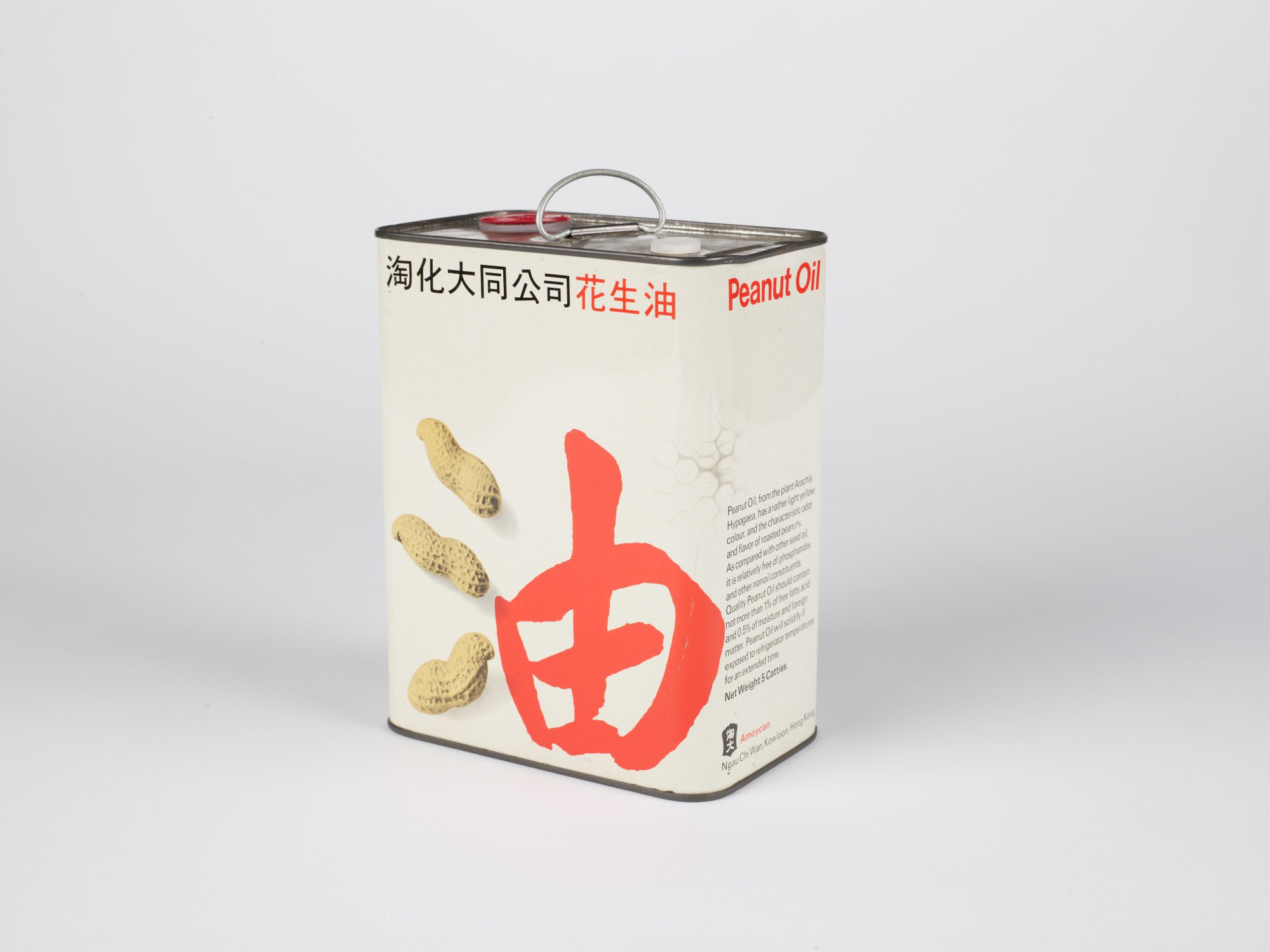
“M+ is a global museum,” she says. “We don’t only do things that are to do with Hong Kong.” And the exhibition will help make that point.
Steiner is characteristically modest about joining such company, and about his work being enshrined in a museum as an academic resource to be picked over and written about into the future.
“It’s a home,” he says with a shrug. “I’ve spent my career here, and I’m happy that [the archive] is going to be in M+. I’d like people to be able to see what I’ve done, and [to] make them think, ‘Would there be other ways of expressing this?’”
He has said that a designer is only as good as his client, although he declines to name any examples, good or bad.
“I did have the thought of having a company called ‘The Client’s Wife’ because then I could say, ‘Designed by the client’s wife’. I find that a lot of clients aren’t visual at all. They say, ‘I’d like to study this overnight’, but what they want to do is to show it to their wives because they’re artistic.”
Although the language of branding barely existed earlier in his career, it is now on everyone’s lips. Have clients become more sophisticated?
“There was less symbolism in the old days. You had names written out. They were verbal rather than visual. It’s something that is hard to explain sometimes to people who aren’t visually oriented – a lot of them tend to be more numerical.”
But the process of creating a logo has not changed much, he says.
“It’s sometimes called the ‘a-ha’ moment. That’s it. It’s just some people are visual, some are numerical, and some are verbal. And you want to get something that’s on the back of a truck, for instance, that you see and you know what it represents.”
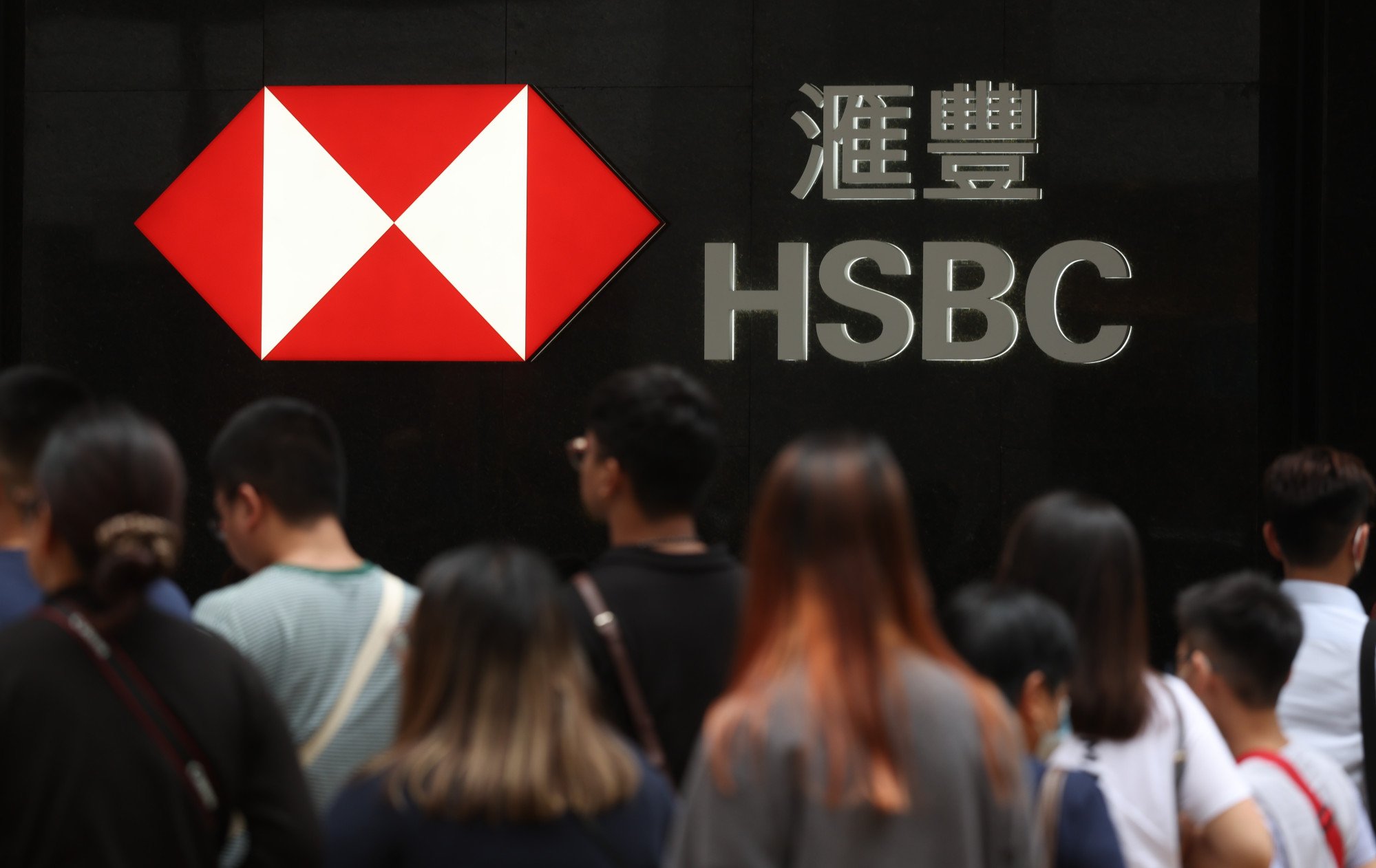
The HSBC logo, an adaptation of the 160-year-old company’s original flag, was intended to be geographically and culturally neutral, devised as it was to give a common identity to a rapidly expanding network of acquisitions in territories around the world.
If there is an individual quality for which Steiner is known, it’s the creation of corporate identities that simultaneously address Chinese and Western audiences, and the adaptation of existing Western designs to ready them for entry to the Chinese market.
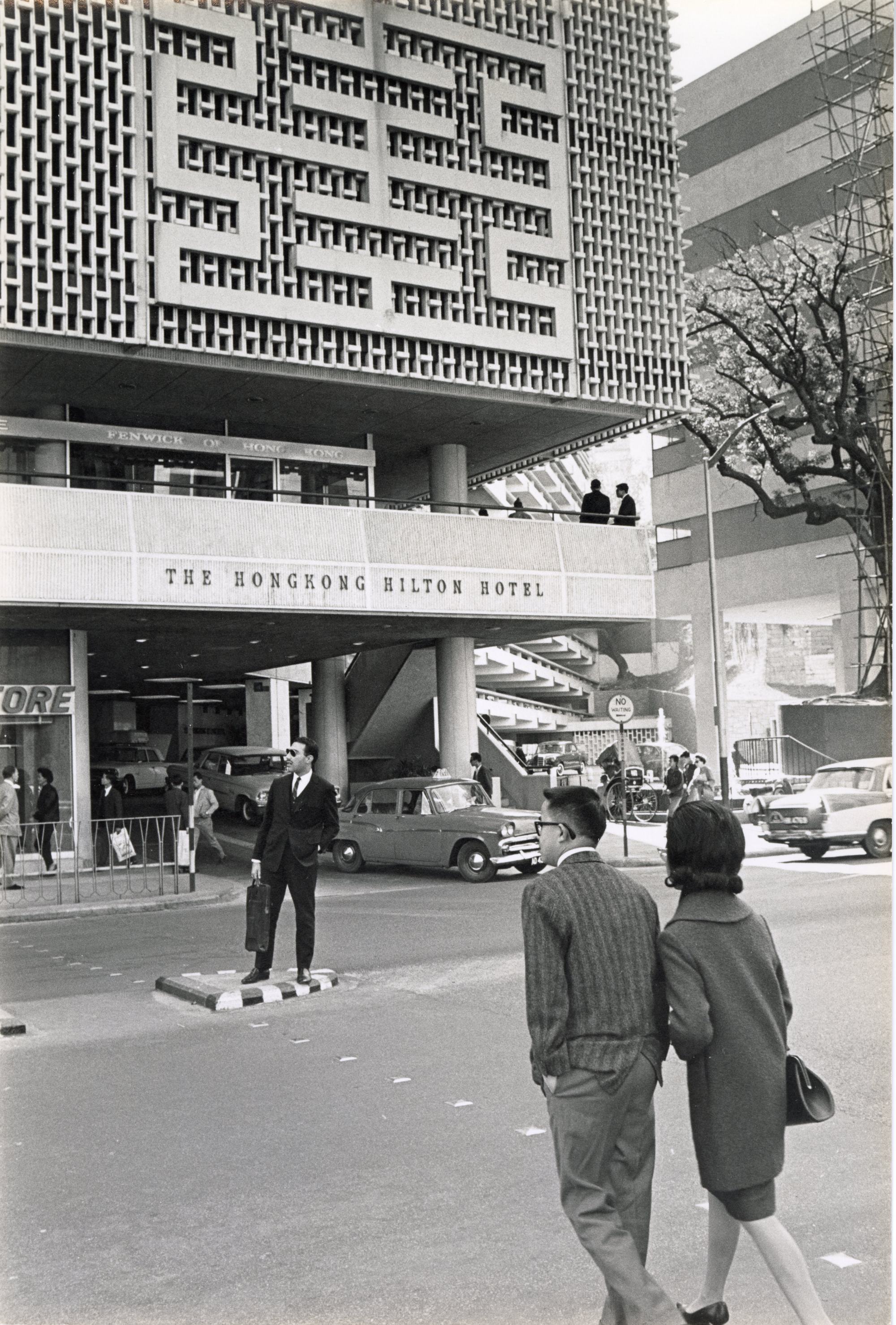
Pang cites the logo of the now-vanished Hong Kong Hilton Hotel.
“It has this outline that can be read in multiple ways. You can think of it as Chinese wooden lattice work. You can also think of it as the Chinese character for longevity.”
Steiner’s career has its roots in a time when physical objects had to be shopped for and placed in photographs, and when the tools of a designer included a drafting table, cutting board and scalpel. He’s worked through the early days of desktop publishing into the fully digital age, but admits a continuing resistance to machines, except for correspondence.
“I work with a pencil or whatever, and I find that much faster, instead of setting something up on a computer.”
He has staff to scan his sketches where necessary, which historically, says Pang, have quite often been done on hotel notepads. He jots down words and designs whenever and wherever they come to him.
Has he otherwise changed with the times?
His book-strewn office is also lined with posters for events long past, including one for an environmental conference in Kyoto showing the anguished visage of a sculpture forming the contours of a garbage bag.
There is also one of the Hong Kong Designers Association’s Design98Show. This reproduces Francisco de Goya’s 18th-century provocative nude, La maja desnuda, in uncompromising juxtaposition to a Chinese calligraphy brush.
“There are many things that Henry did that today wouldn’t be possible,” says Pang. “There’s definitely an element of exoticisation; definitely an element sometimes of objectification of women. And that would be very difficult to do now.”
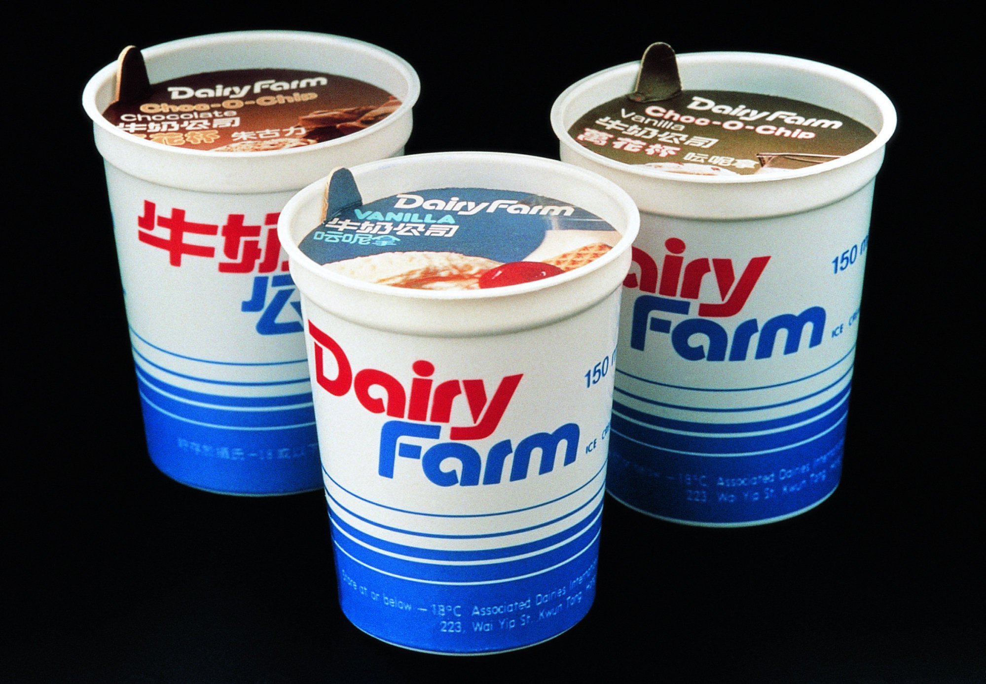
Steiner demurs, but acknowledges that even at the time the Goya design “caused a bit of a stir”.
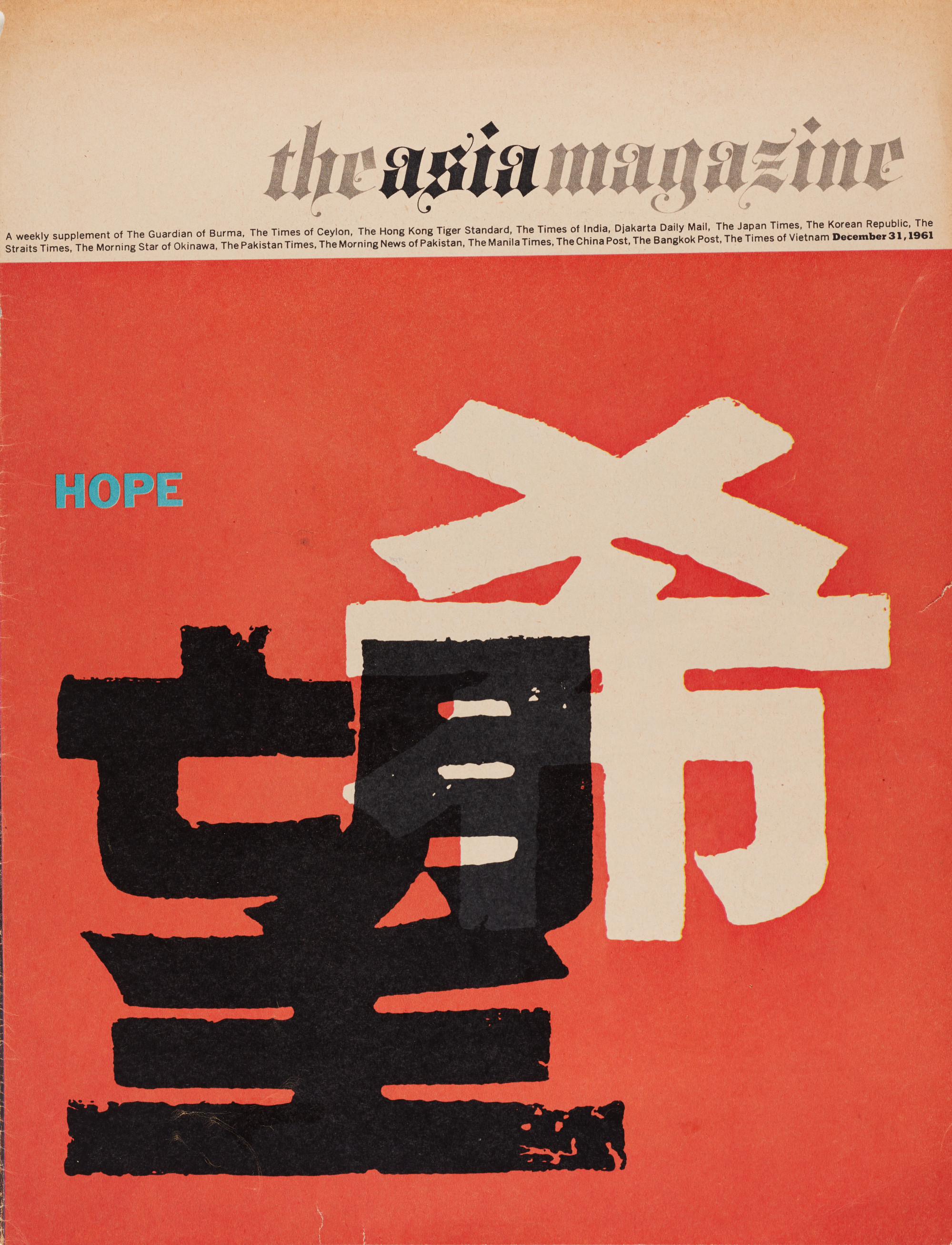
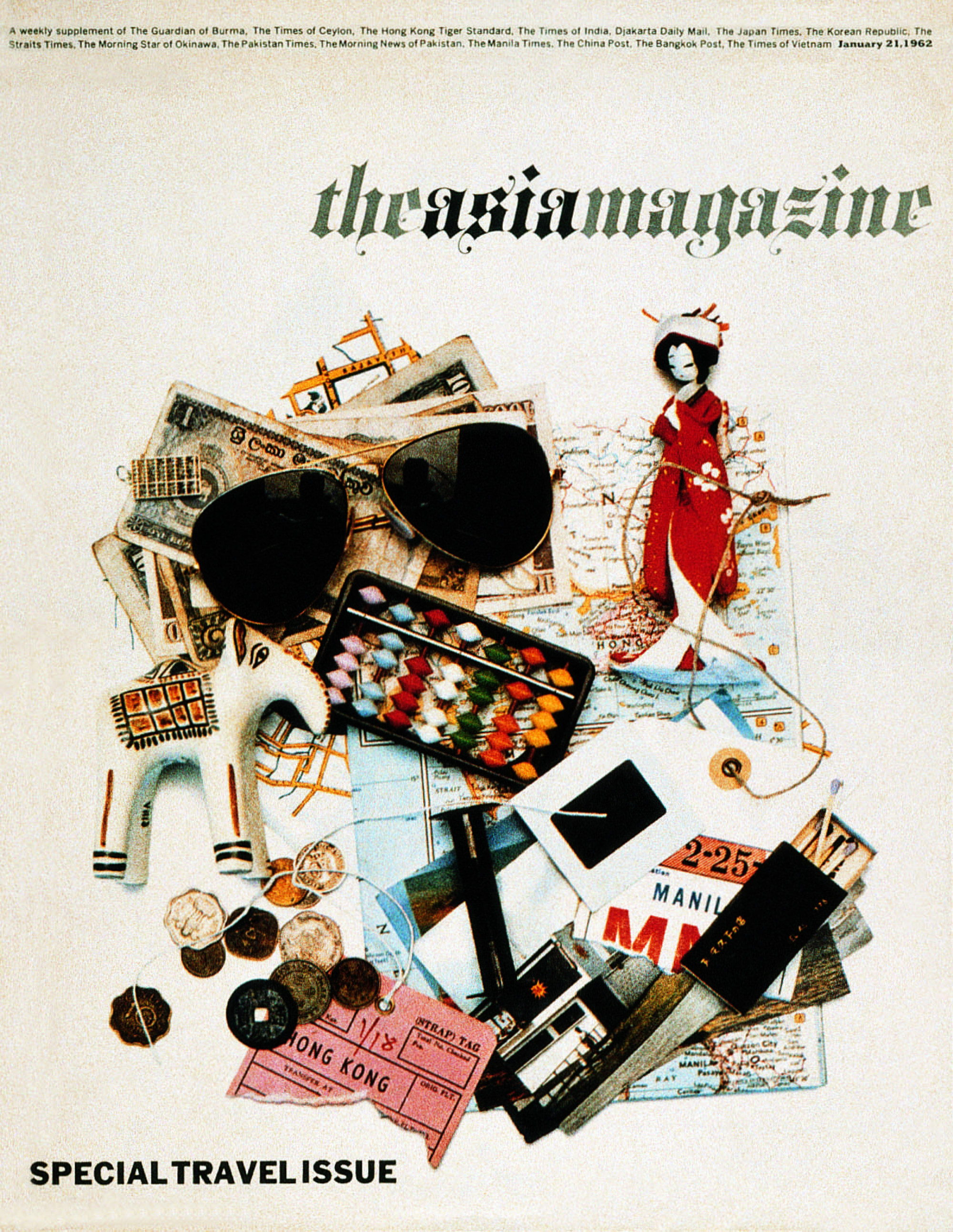
But this does mean that the exhibition, in incorporating such works alongside his magazine layouts – including that for The Asia Magazine – and much more, will also chart changes in the traditional culture of the city, and in its social mores.
“We want to focus on M+ as a repository for the Henry Steiner archive and indicate that this is a resource for researchers … to access his work,” says Pang.
Those with a more everyday interest in graphic design’s impact on their daily lives will also enjoy Henry Steiner’s Hong Kong, published by Zolima CityMag this month, and will discover that they are more familiar with his work than they thought.
“It’s a deep dive into Steiner’s work, the impact it had on Hong Kong, and how Hong Kong influenced him,” says Christopher DeWolf, co-author with writer-designer Billy Potts, both of Zolima.
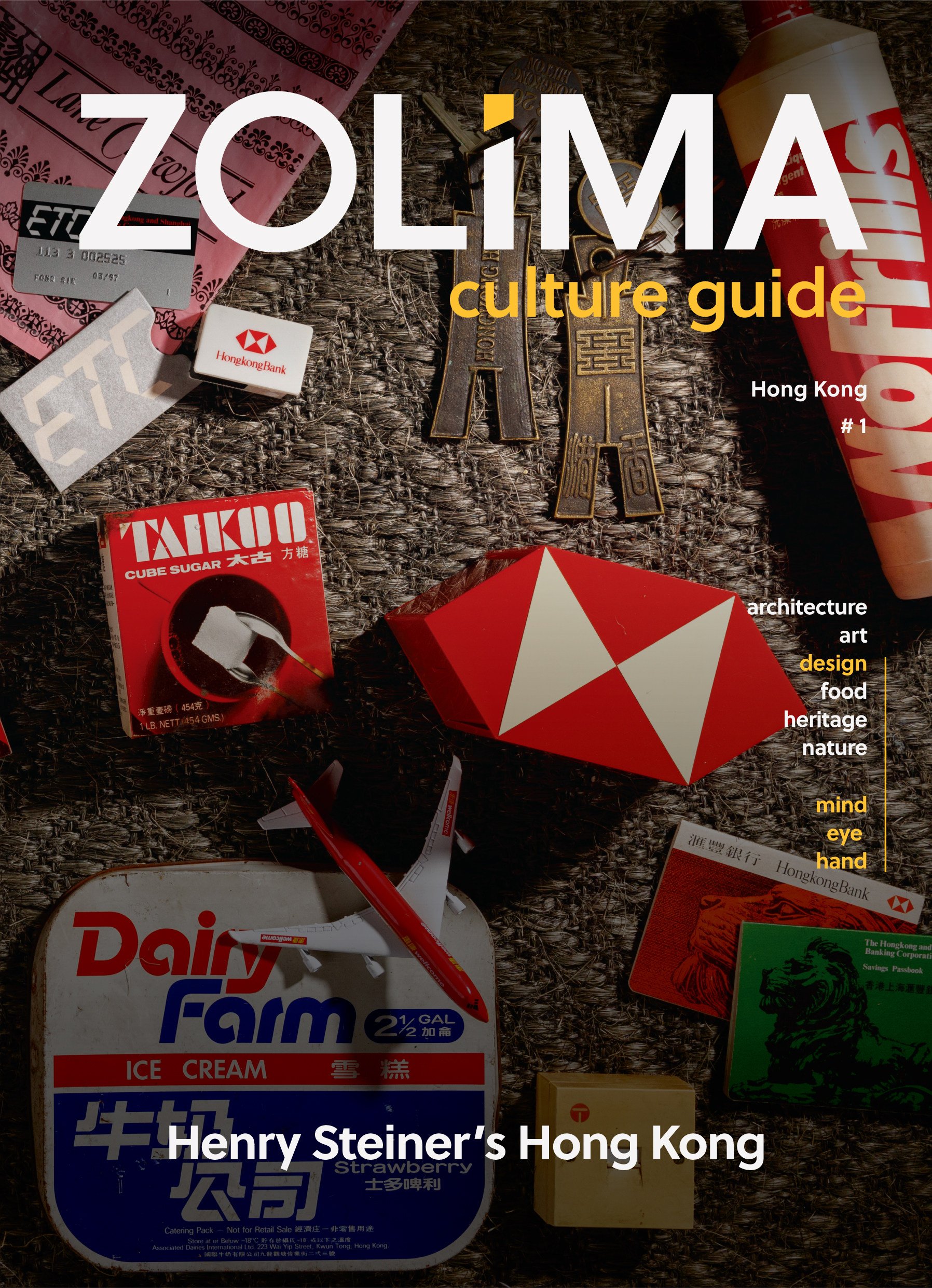
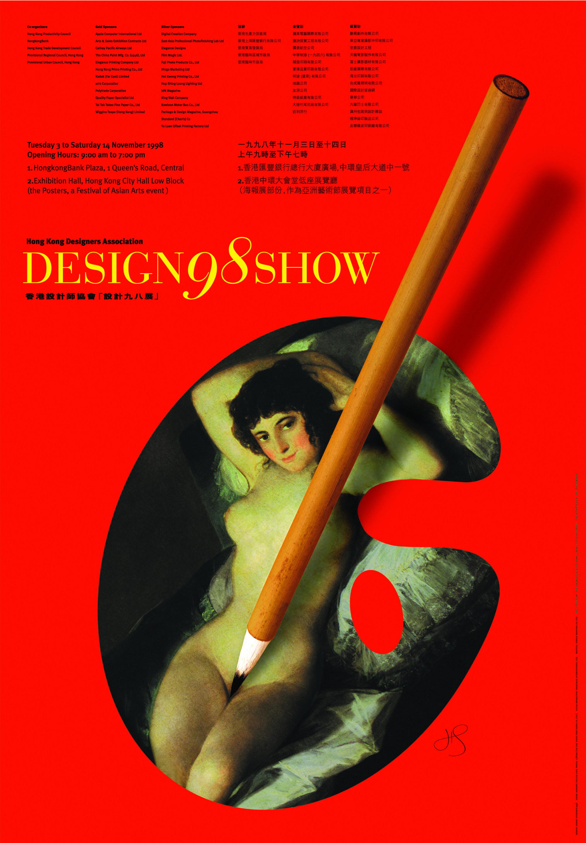
As the book shows, Steiner’s impact on Hong Kong was felt not only in the presence of his designs in everyday life, but in branding, such as for retailer Dairy Farm, that acknowledged both the growing economic power of Chinese businesses and the importance of Chinese consumers to colonial enterprises.
His designs gave both Chinese and English versions of corporate identities equal weight or fused Chinese and Western elements together.
“It’s obvious now to always have Chinese elements if you work in Hong Kong, but at that time, in the 70s and 80s, it wasn’t quite as common,” says DeWolf. “He incorporated them into an international, modern, Western framework.”
A much more personal, and sometimes even playful, Steiner can be seen in magazine covers and items such as stationery, menus and company annual reports, he says, which will be visible both in the 200-page book and at the exhibition.
Steiner is still busy at 90, and the term that Pang says is often used to describe the HSBC logo might perhaps also be applied to the designer himself.
Indestructible.
Henry Steiner: The Art of Graphic Communication opens at M+ on 15 June.

