Online observers have been predictably snarky. One comment posted to an article in design magazine Dezeen compared it to a stack of drinks cans; another likened it to the tailpipe of a car.
“I can’t help thinking this would never have met the intellectual and design rigour Zaha Hadid bestowed on the practice’s work,” read a harsh pronouncement. (Since Hadid’s death in 2016, her firm has carried the torch.)
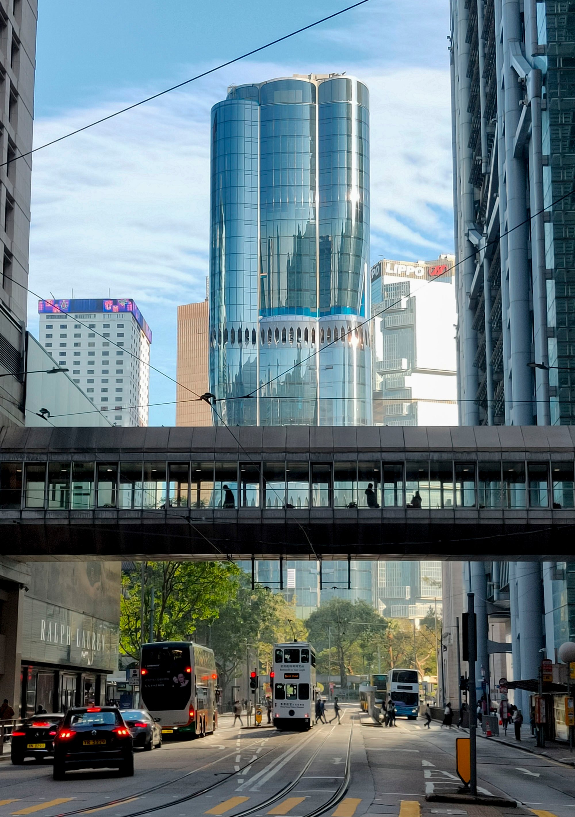
When Henderson Land paid HK$23.3 billion (US$3 billion) for the old car park in 2017 – making it the world’s most expensive piece of land at the time, according to some reports – it wanted a new icon that could stand up to the many famous towers nearby, from Cesar Pelli’s Two IFC to Norman Foster’s HSBC Building.
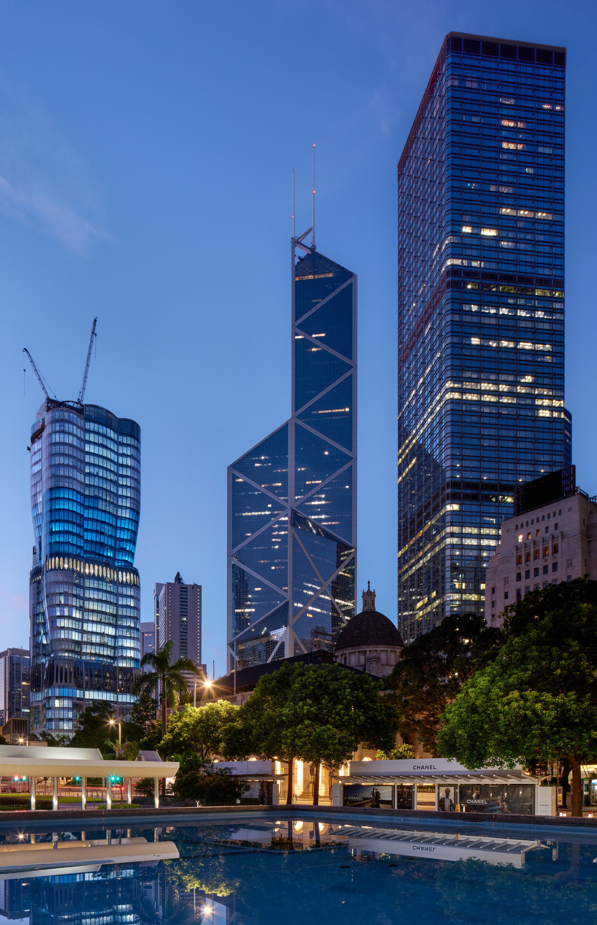
It also wanted something that could counteract the supposedly negative feng shui of I.M. Pei’s shard-like Bank of China Tower, which stands across Queensway from The Henderson.
3 floors, balcony, terrace – Nordic look makes the most of Hong Kong flat
3 floors, balcony, terrace – Nordic look makes the most of Hong Kong flat
It chose ZHA after a competition.
“The brief said this has to be a very soft building,” says Sara Klomps, a director at ZHA. “It has to offset the ‘angleness’ of the I.M. Pei tower. Luckily we do a lot of soft buildings.”
That is something Hadid became famous for as she built up her practice with partner Patrik Schumacher. As early adopters of digital parametric design – which uses computer algorithms to create forms – they created buildings with sweeping curves that threw off the hard edges of modern architecture. Several ZHA buildings have been described in gendered terms.
“The appeal of her work lies partly at least in the sense that they embody a unique female personality,” noted The Guardian in an editorial published after Hadid’s death.
“She resisted gender stereotyping but it is not demeaning to insist that her work will always be seen as voluptuously feminine.”
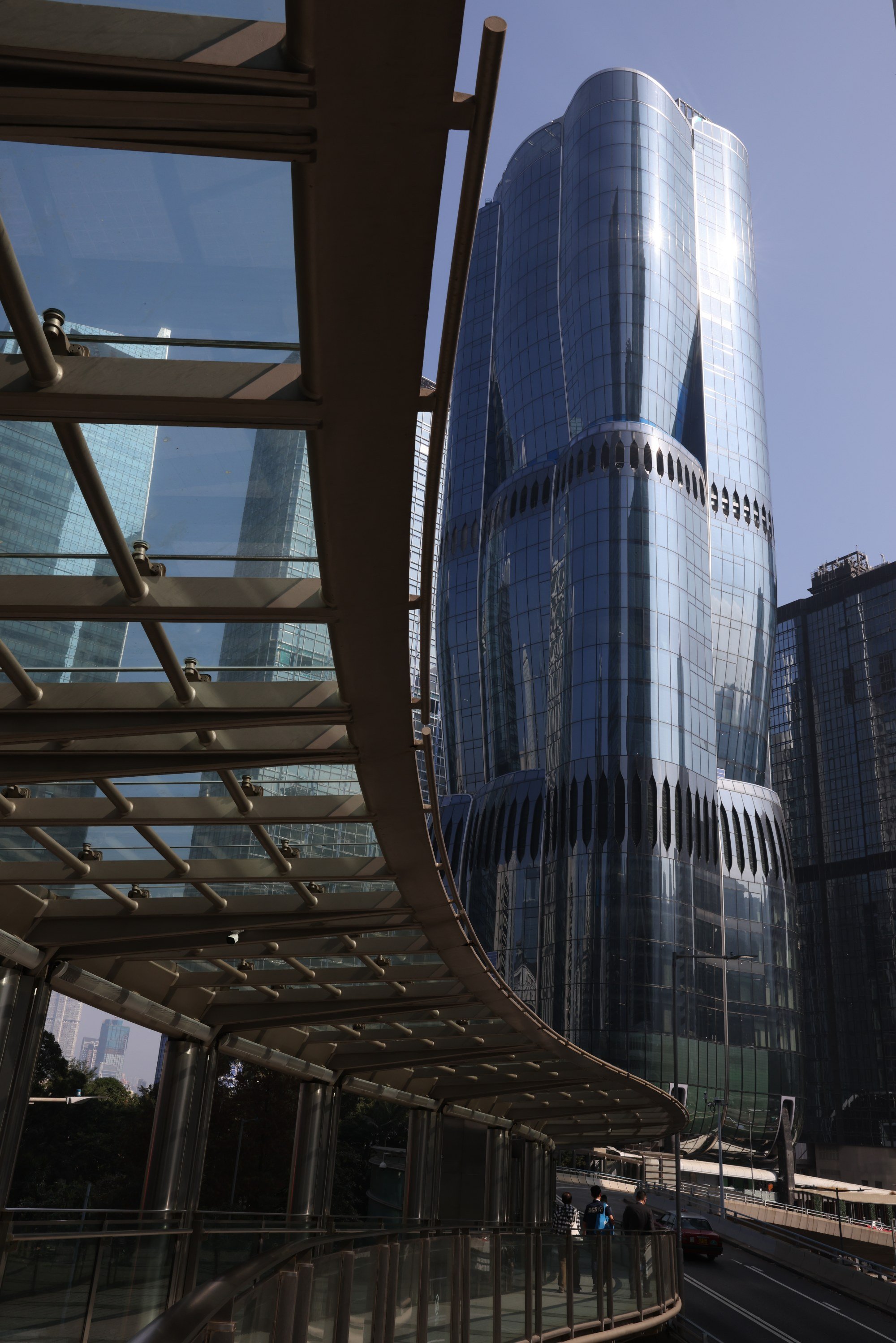
There is certainly something organic in the undulating form of The Henderson’s glass facade. But this wasn’t simply done to be “soft” in the face of its more angular neighbours.
“We wanted the public realm to remain open and basically float the building above it,” Klomps says. “Instead of having just offices or a mall where it’s this anonymous, could-be-anywhere space, we have several levels where you can go, have a coffee or something, and it’s part of the public realm.”
Can anything save 3 historic Hong Kong villages from the wrecking ball?
Can anything save 3 historic Hong Kong villages from the wrecking ball?
There will be a landscaped drop-off point on the ground floor, but most people will access the building from the footbridge level one floor up.
“The land lease came with the condition of three footbridges crossing the site. They had to be maintained. We could have done a typical Hong Kong-style mall, but we found that very difficult to navigate,” Klomps says.
“When you walk along the footbridges you find it easy to see where you are but when you enter a mall you get lost – at least I do.”
Instead, they had the idea of extending the lush ambience of Chater Garden into the building.
“Given the very green surroundings, we didn’t want to cut the city off from the park. We want this to be a building that feels like it’s a part of the park,” Klomps says.
The tower’s mirrored facade curves into a third-floor, double-height public space to reflect the greenery.
“There’s an extensive amount of planting,” Klomps says. “There are trees where, if you’re walking on the footbridges and they’re fully matured, you’ll be walking in the treetops.”
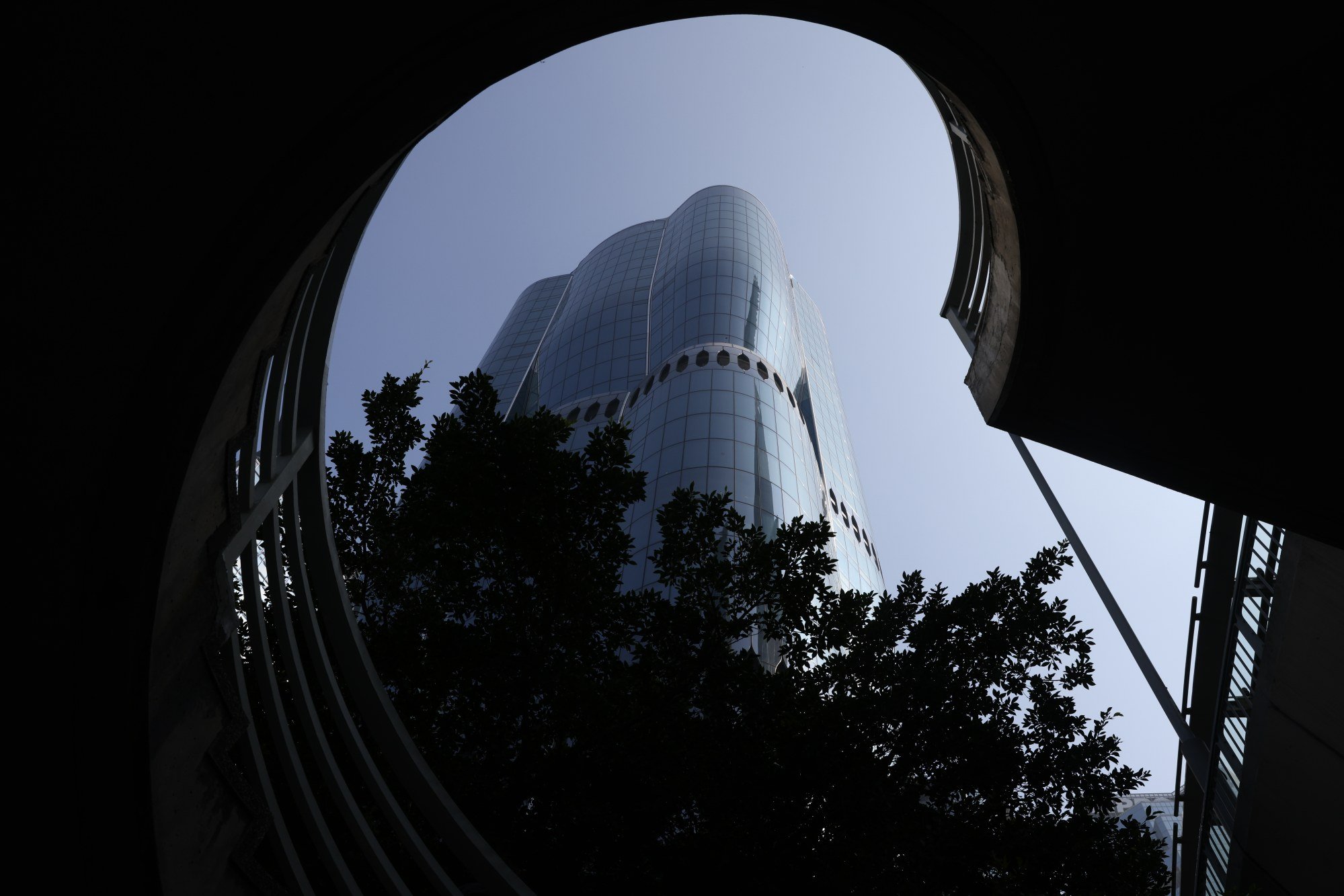
Adding to the sense of openness is an offset core, which is to say the main column that contains all the building’s services, including lifts and stairwells, is in a corner rather than the centre of the tower.
This gives office tenants sweeping views of the city, but Klomps says it also has the advantage of keeping the third-floor public space from feeling like an office lobby.
It also provides the opportunity for a large, unobstructed space on the rooftop for events.
“Like the ground floor it’s very transparent to offer a view across the city,” Klomps says.
We wouldn’t have done [the surrounding towers] justice if we had done just a normal building
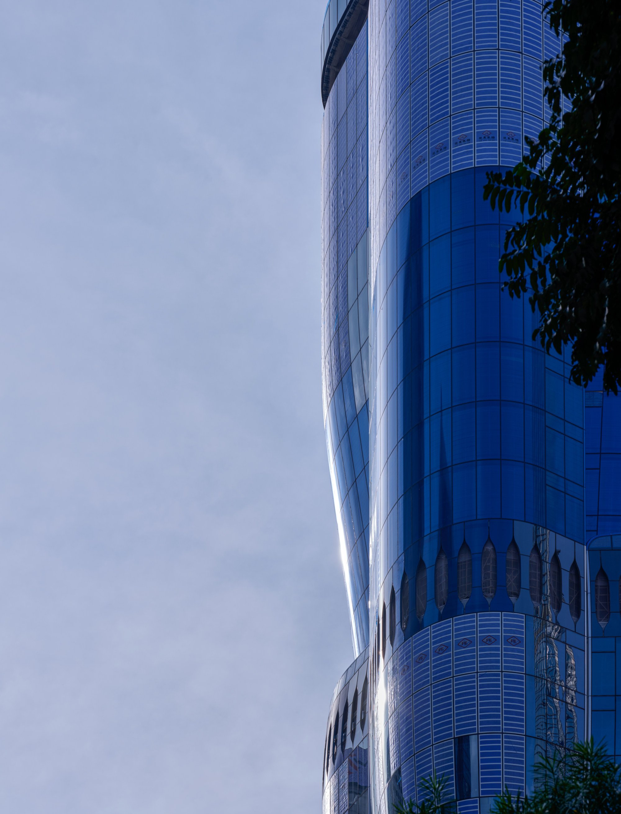
Achieving transparency with a curved glass facade wasn’t easy.
“There’s a lot of curved and double curved glass,” Klomps says, with the building’s undulating form making for unusual shapes.
“If it’s not curved properly you can’t see through it properly. Henderson Land basically invited every large glass manufacturer out there, anyone with the capacity to produce this extent of glass.”
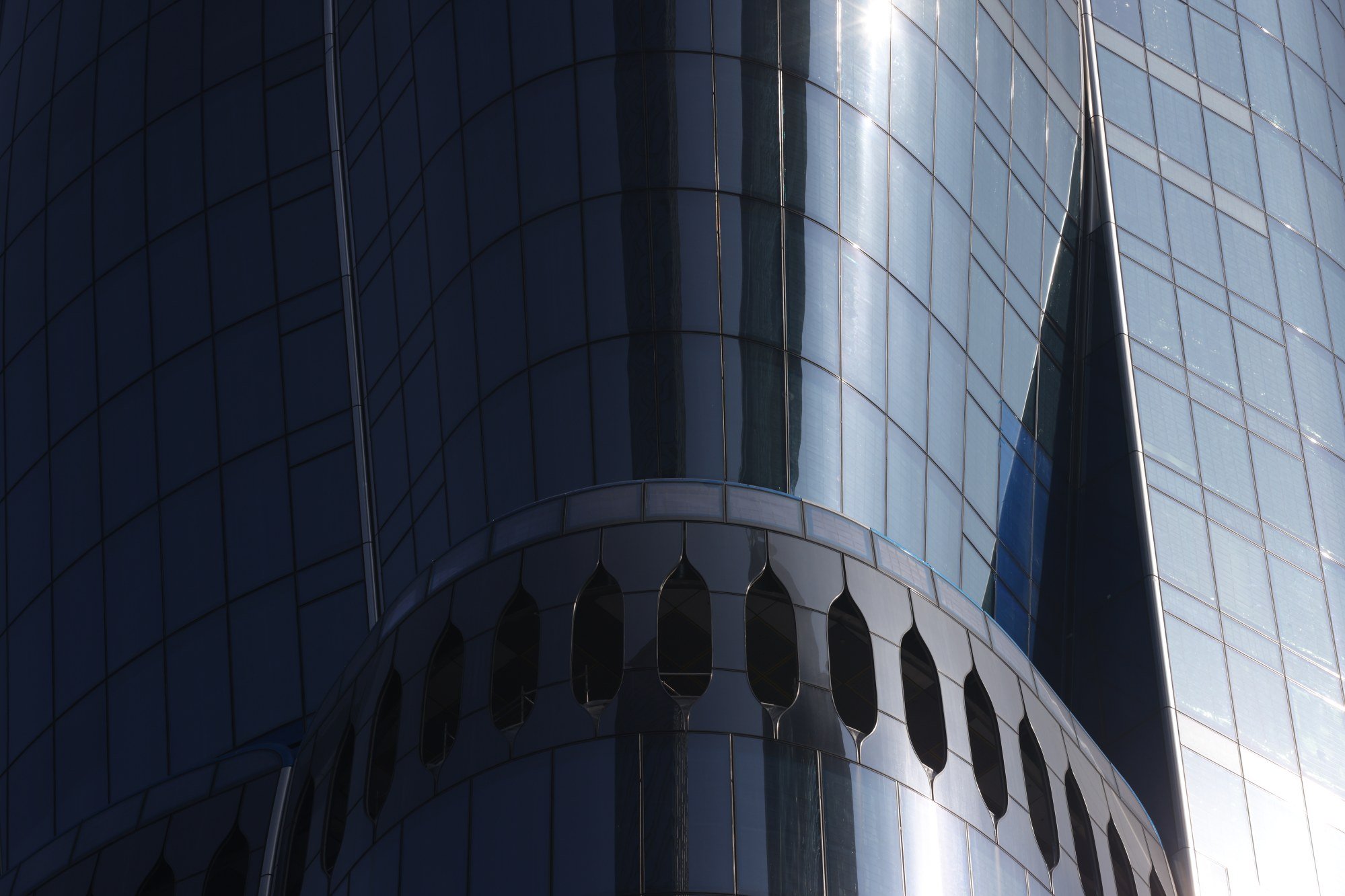
Two suppliers were chosen: German glass specialist Seele, which manufactured the roof structure and lower levels, whose curves were the most technically complex; and Hong Kong-based Far East, which dealt with all the floors in between.
The result is a building unlikely to leave anyone unmoved, whether they like it or not.
“You can do an ordinary building that doesn’t stand out and nobody will notice. But if it looks strange, it sparks discussion. I guess it’s the human condition,” Klomps says.
“Some of us don’t deal well with doing something which is not typical. Why is that? I guess it’s possible there’s a thought that if you’re going to do something like that, the next building will be even more crazy. It’s a fear.”
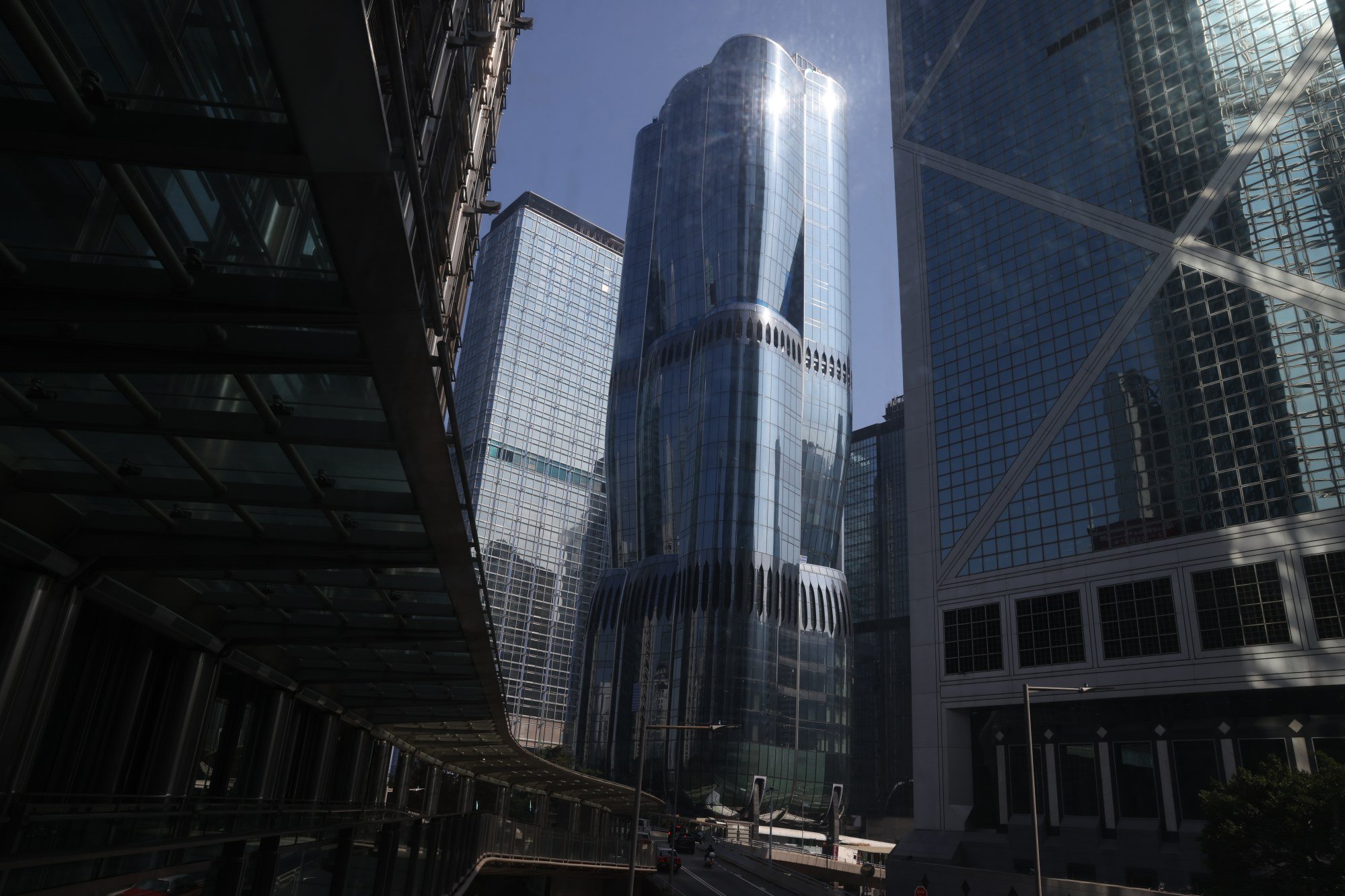
She notes the very distinctive context in which The Henderson now stands. There are historic landmarks such as the Court of Final Appeal Building and original Bank of China Building; modernist icons including James Kinoshita’s Jardine House; and quirky postmodern towers like Paul Rudolph’s Lippo Centre, with its angular protrusions that have drawn comparisons with koalas climbing a tree.
“These are all icons for historic or architectural reasons,” Klomps says. “So you make something very special that stands out in a way but also blends into this group of special buildings. We wouldn’t have done them justice if we had done just a normal building.”

