Smiling about the unconventional set-up, the marketing executive explains that her immediate family also played important roles in the refurbishment of her first marital home.
Her mother, a furniture lover who lives nearby, bequeathed collectible kit, including a 1970s-designed Maralunga leather sofa by Vico Magistretti for Cassina; her sister, a furniture designer working in Japan, introduced her to Chan.
Hintegro’s portfolio of residential projects gelled, partly because of the studio’s proclivity for mid-century modern (MCM) design, infused with an Eastern sensibility.
But aside from style, future proofing was key to Hintegro’s redesign of Luk and Yeung’s home.
For them that meant flexibility. The flat has been updated to accommodate dogs, hence the tiled floor, and one day perhaps a family of their own, which is why loose furniture in the spare room makes sense.
When I have friends around, if they want a cup of water, they can just grab it here instead of having to go into the kitchen
Functionality was also important, as were concessions to cost, the most visible of which can be found in the cabinetry.
“We all remember when we were young, a lot of woodwork was like this,” says Chan, forgetting for a moment the different age groups present when he points to the “framed” cabinets throughout the flat. “Only the trim is hardwood but the inner part is plastic laminate.
“This is quite Hong Kong; you can find the same details in cha chaan teng and Star Ferry benches.”
The flat is spacious enough to support working from home. But instead of at a desk/dresser in the multipurpose walk-in wardrobe, Luk prefers to log in from the dining table, and not only because the area enjoys a direct sea view and has plenty of elbow room.
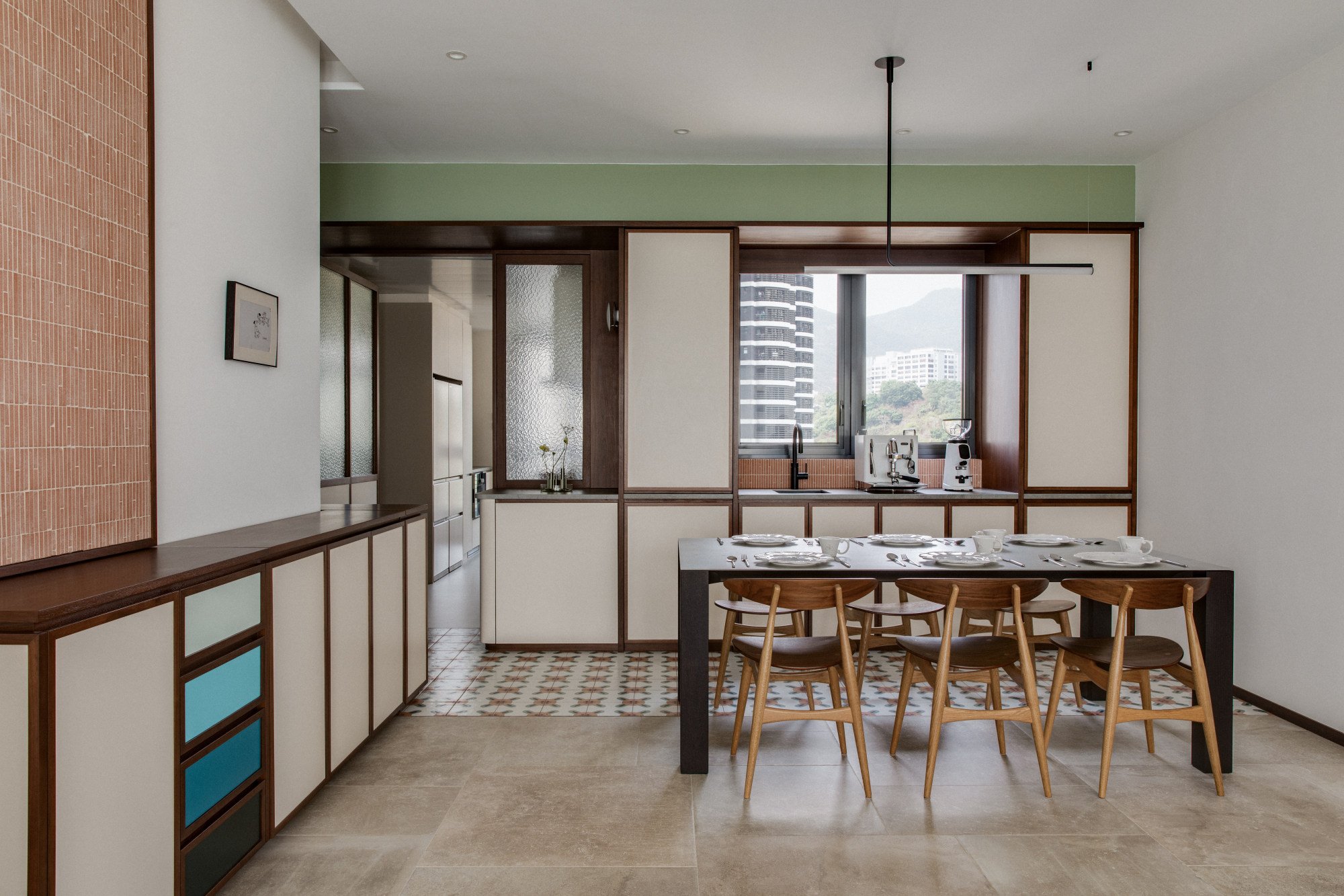
Coffee-making paraphernalia and a sink are close at hand, courtesy of a dedicated refreshment station that extends from the kitchen proper.
“I wanted an area where everything’s accessible,” she says. “When I have friends around, if they want a cup of water, they can just grab it here instead of having to go into the kitchen.”
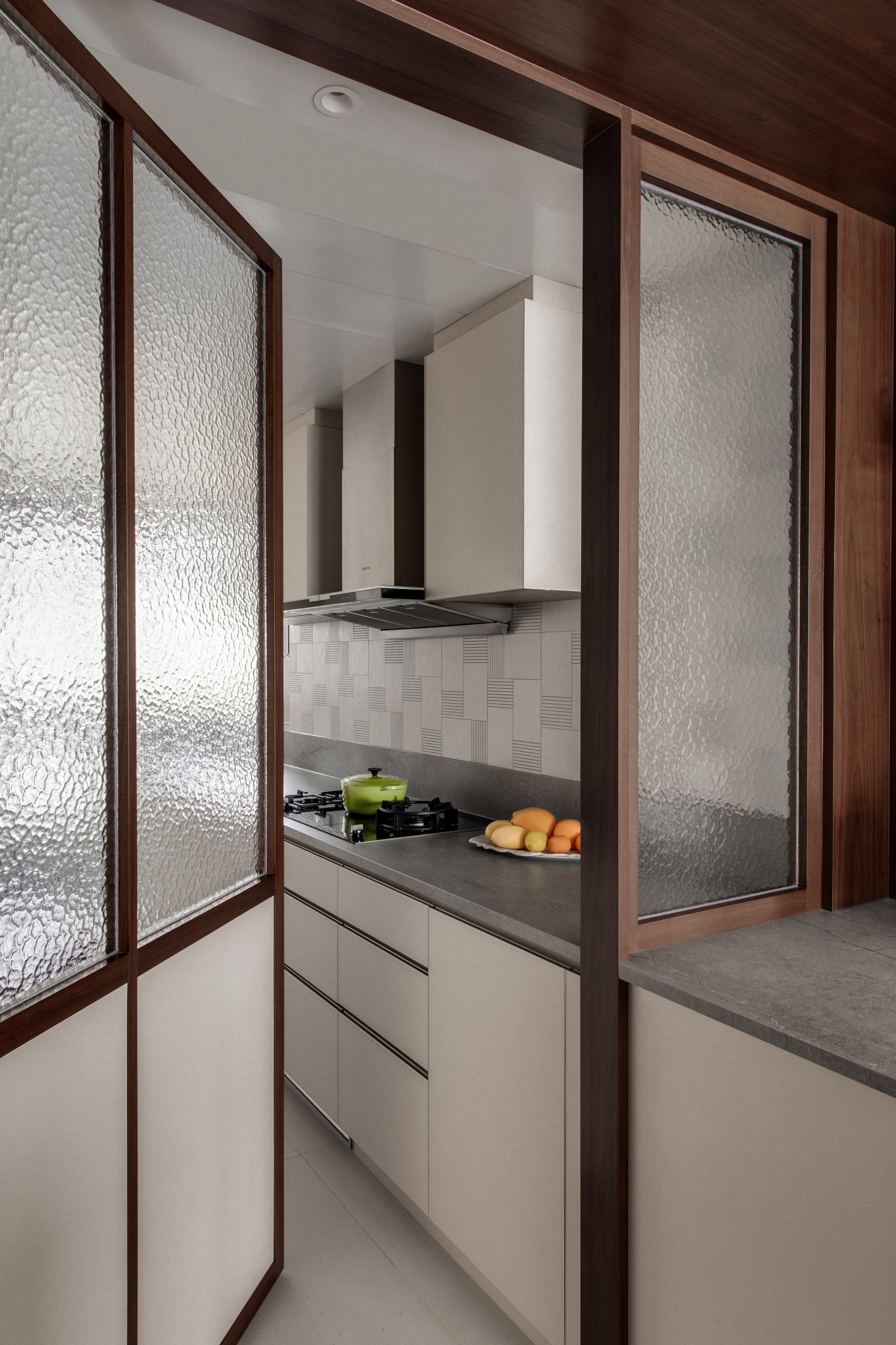
The drinks zone is an add-on to the cabinetry in the kitchen, which now stretches from the main (and original) food-preparation area, around a fixed textured-glass corner. The extension, into the open living and dining room, lends continuity and enlarges the area visually.
So does a more obvious L-shaped design nearby, although this feature can be reconfigured and moved easily. Low cabinets on castors wrap around a bend, providing space for shoes in the foyer and storage for other items in the serif portion gracing the living room.
“In 10 years, if we want to move or do another renovation […] it’s more flexible,” says Luk.
Also relatively easy to change are some of the flashes of colour that distinguish the spaces. While the overall palette combines warm and cool shades, in the dining area calm hues set the mood.
A set of drawers in blue gradients brings to mind Finn Juhl’s memorable sideboards with scales of a similar hue. Providing interest is a band of avocado green high up on a nearby wall.
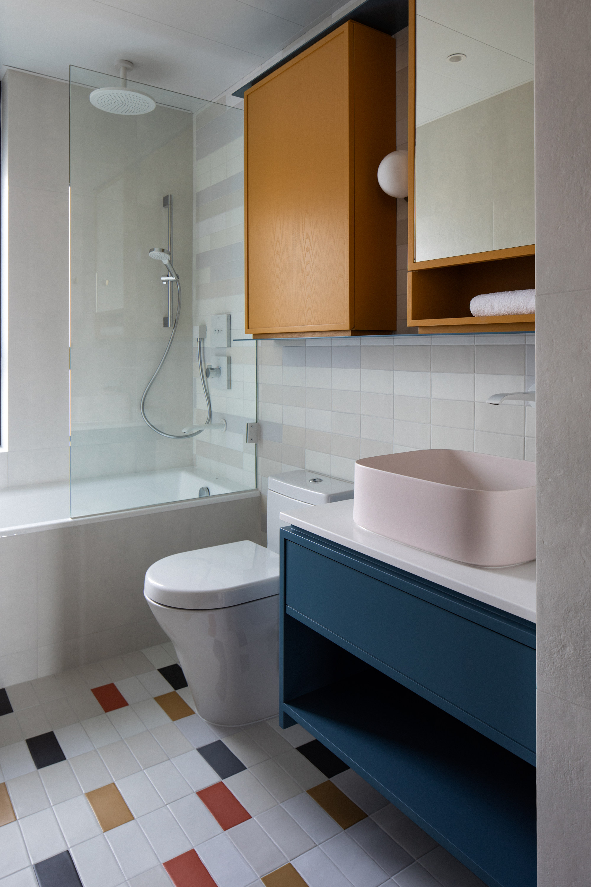
Colour also distinguishes the spare bathroom, where the floor features a grid of rectangular tiles in mustard, rust, blue, grey and white. Most prominent, however, is the saffron ceiling in a corridor.
“Yellow is my favourite colour and I’ve always wanted it to be somewhere in my home,” says Luk. “I don’t really hate any colour, so it was more how to balance white and vibrant colours.”
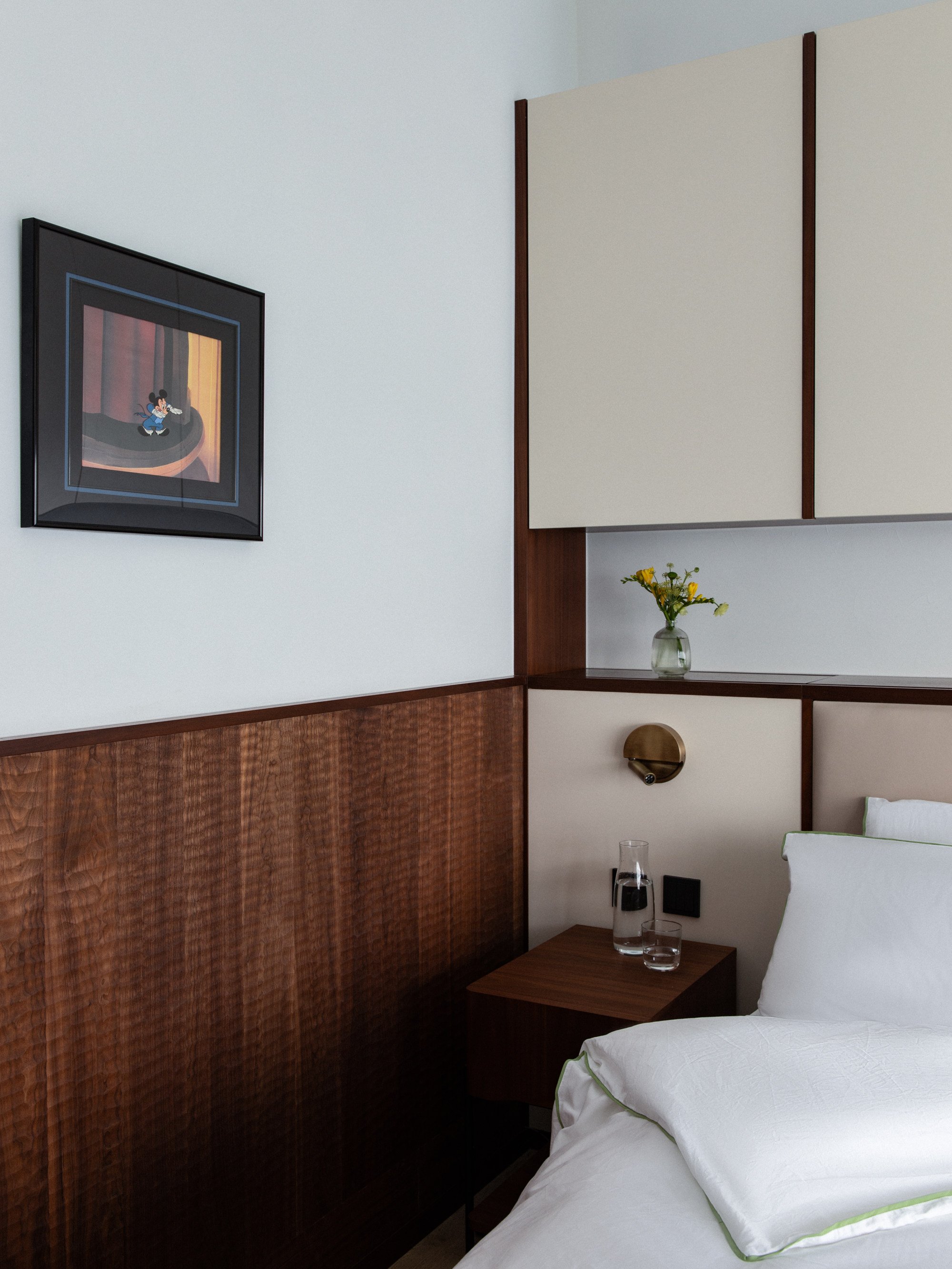
If there is one room where MCM meets the East most successfully it is the main bedroom. Here a bedhead combines functional open shelving with cabinets embracing a look both fresh and retro.
I love the different shades of walnut, some darker, some paler. The carving creates interesting light and shadow
Again, hardwood trims are combined with milky laminate fronts, but providing warmth is a timber wall feature.
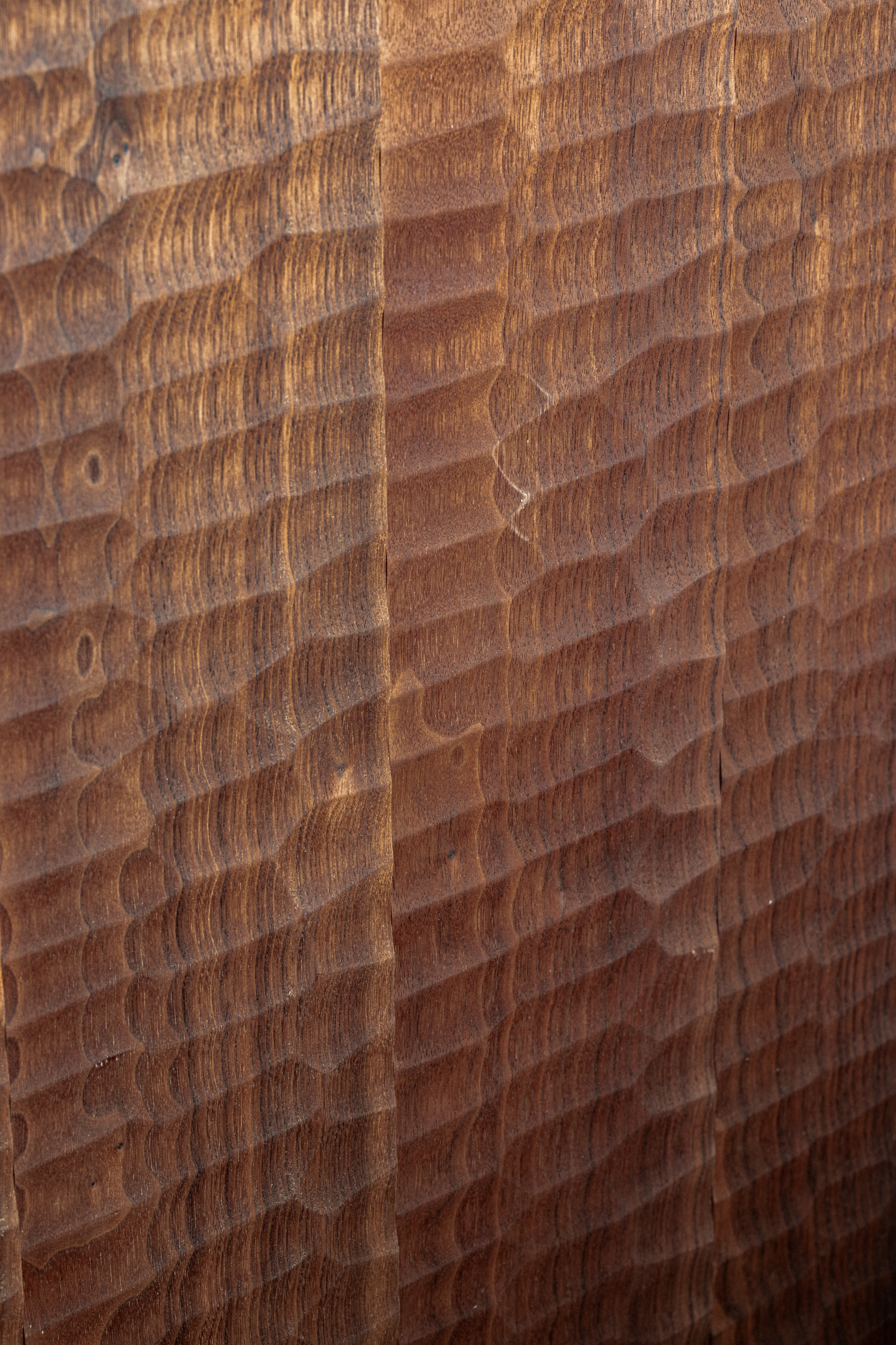
Hintegro imported walnut planks from Japan featuring a naguri dimpled pattern. Although meant for the floor, they were used as vertical panels (see Tried + tested below).
“Mid-century designs often used wood on dado walls,” says Chan, explaining why he used the naguri planks for this purpose. “I love the different shades of walnut, some darker, some paler. The carving creates interesting light and shadow.”
Although Luk and Yeung wanted a timeless look with “nothing complicated or fancy”, they also liked the idea of recognising Hong Kong history through various shades of sepia.
“We were both born in the 90s,” Luk volunteers about her and her husband. “But we also wanted a bit of Keith’s 80s.”
And, lest we forget, the MCM era decades before.
Living room
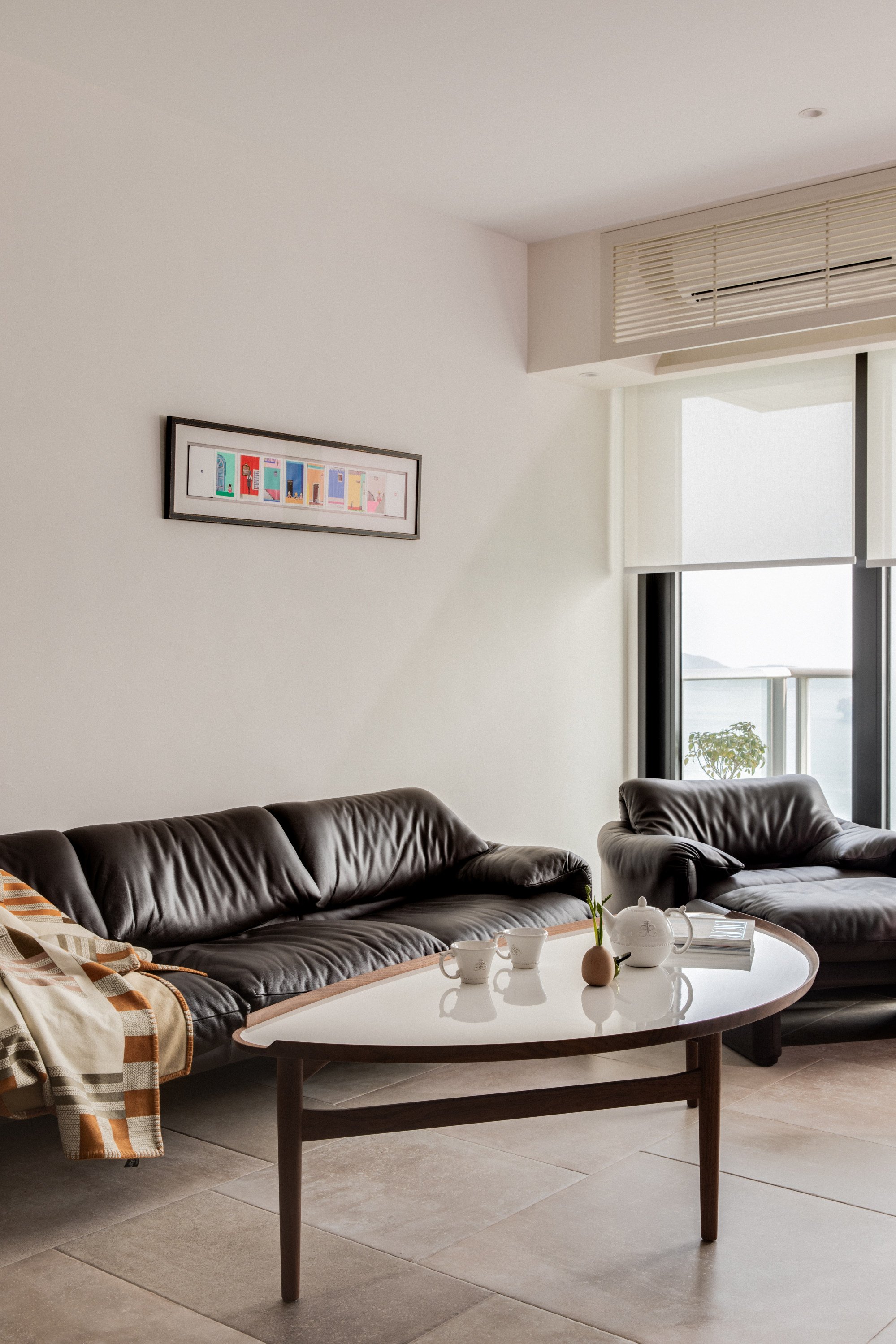
Once owned by Vanny Luk’s mother, the 15-year-old Maralunga sofa, designed by Vico Magistretti for Cassina (cassina.com) in the 1970s, was in need of restoration when she gifted it to her daughter and son-in-law for their new home.
To return the leather to its original beauty, IV Pro Service (ivproservice.com), which specialises in renewing car seats and furniture, not only cleaned and conditioned the material, but also restored the colour and repaired small tears, thereby extending its life.
The Finn Juhl cocktail table was from Out of Stock (outofstock.com.hk). The artwork on the wall is a collage created by a friend of Luk’s mother, Pun Hok Kan (Instagram @hokkan_art).
Living area detail
The cabinetry, on wheels, features doors with hardwood trims around off-white plastic laminate. Keith Chan, of Hintegro (hintegro.com), came up with a set of drawers that recall Danish architect Finn Juhl’s blue-scaled designs.
Dining area
The hand-designed Mutina Mattonelle Margherita floor tiles, between the drinks station and dining table, came from Anta, as did the large-format Carrière du Kronos floor tiles.
The dining table was from Andreu World (andreuworld.com) and the CH33T chairs, by Carl Hansen & Son, were from Out of Stock. The Ambrosia Ceiling Lamp 120 is by Marset (marset.com).
Kitchen
The cabinetry, from KODA Kitchen (kodakitchen.com), extends from the kitchen, around a corner to the drink station. Textured glass, used as a divider, enhances the mid-century modern look and is also a feature of the door.
Main bedroom
Mid-century modern style guided the design of the main bedroom. An open shelf behind the bed is stylishly practical. The bedside Ledtube wall lights by Marset came from Apartment (20B Blue Pool Road, Happy Valley, tel: 2882 2198). The bedside table came from Indigo Living (indigo-living.com).
Wainscoting was created with walnut planks Hintegro imported from Japan with the traditional naguri scalloped pattern. The artwork came from Storerooms (storerooms.hk).
Main en suite
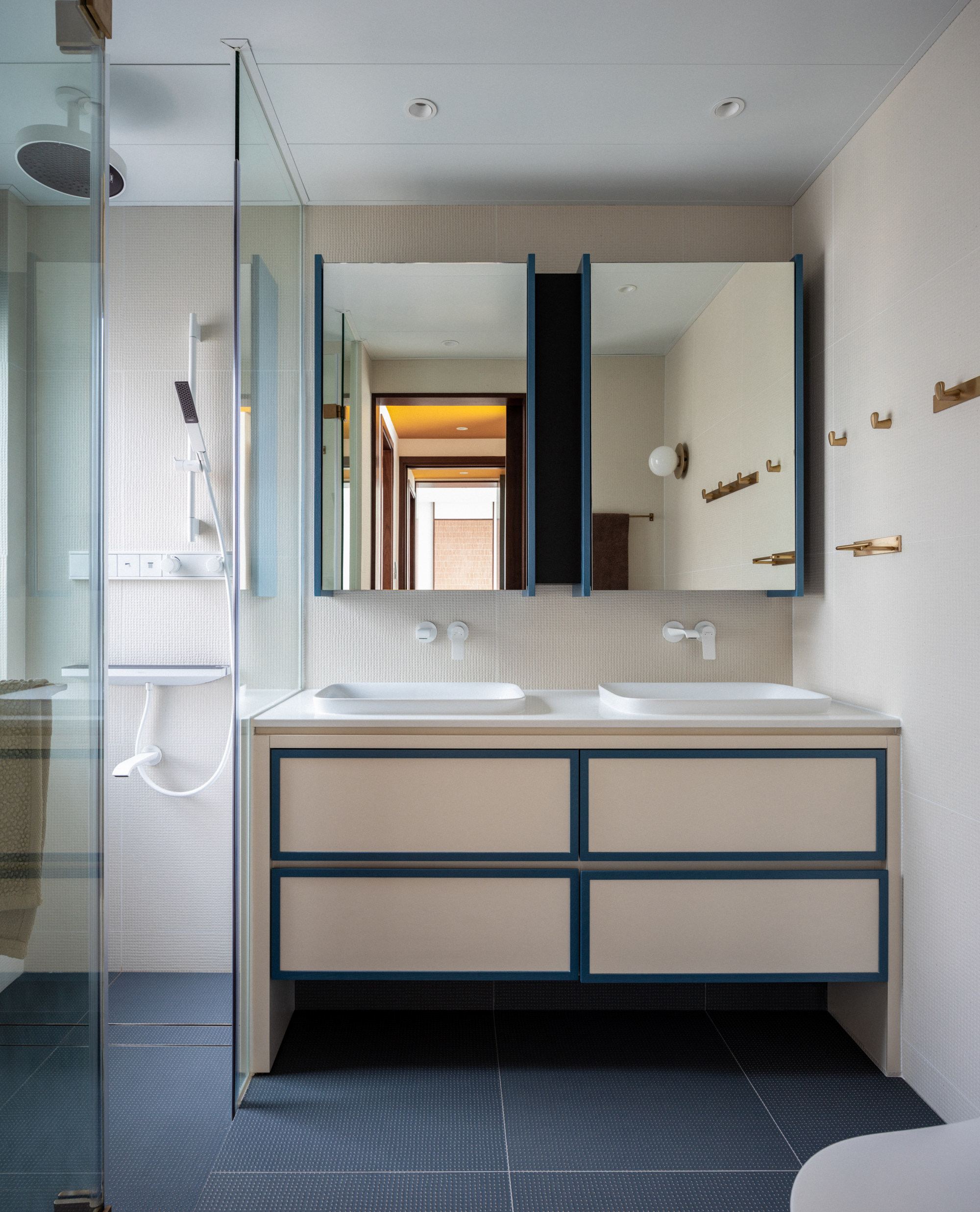
White and blue distinguish the main en suite bathroom, which, like the guest bathroom, features shower and tap hardware from Hansgrohe and a Nuura Liila 1 wall lamp.
The floor and wall tiles were from Anta, and the towel and paper holders from the Union Lamoe series from HINT (Instagram @hint.concepts).
Guest bathroom
Colourful Gigacer concrete tiles from Anta form a patchwork underfoot. The Nuura Liila 1 wall lamp is available at the Finnish Design Shop (finnishdesignshop.com) and the hardware was from Hansgrohe (hansgrohe-asia.com). The wall tiles are Mutina Lane from Anta.
Corridor
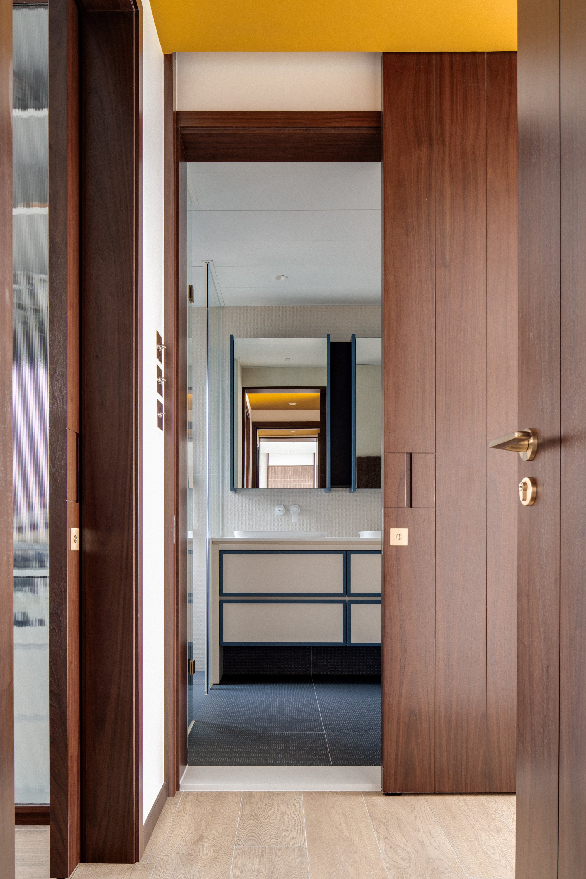
Determined to include yellow somewhere in her home, Luk chose the ceiling above a corridor with high foot traffic. The colour also contrasts well with the walnut panelling.
To the left is the walk-in wardrobe, to the right the main bedroom and straight ahead is the en suite bathroom. Wood-look tiles were chosen to enhance cosiness.
Tried + tested
Naguri is a Japanese woodcut technique in which dimples are gouged into the surface of wood to add texture.
The unique geometric pattern, created with a hand tool called a chouna (like an adze, a tool similar to an axe), also affords interesting light and shadow play.

