The school’s teachings take inspiration from the “less is more” approach of German-born American architect Ludwig Mies van der Rohe, considered a pioneer of modernism. That sat well with Yuen’s penchant for Japanese culture espousing simplicity, Zen and wellness.

“Brainstorming the look and feel of the home, we gravitated towards this kind of aesthetic,” Lim says of the design’s clean lines and palette of natural materials such as wood, terrazzo, rattan and textured plaster.
However, simple is not always straightforward.
“What we’ve found with interiors is that the simpler something is, the harder it is to execute,” he says. “And the better it has to be because you have nothing else to look at.”
Since the first-floor, 1,300 sq ft (120 square metre) flat boasts a serene green outlook, framing the view in an innovative way became an early priority. For this, the designers reworked the idea of a portal, an architectural statement since ancient times.
“Portals are symbolic of passing through a threshold to what lies beyond,” says Lim. In Yuen’s apartment, the structure “creates a sense of depth and visual interest, captivating the eye and inviting exploration within the space”. (For how a modern interpretation was achieved in Yuen’s apartment, see Tried + tested below.)
Without structural walls to contend with, the designers were free to reconfigure the space at will. Only the kitchen and helper’s room remain in their original location.
Elsewhere, what were three bedrooms and two-and-a-half bathrooms gave way to expanded living and dining zones, a yoga platform, home office, bedroom with en suite bathroom, and a guest powder room.
Eliminating traditional thoroughfares afforded spatial options: a corridor became a walk-in wardrobe, for example. And with wide opening pocket doors removing conventional barriers between rooms, circulation is fluid as if in an open loft.
“There is no set direction to the pathway,” says Lim. “The design is meant to flow in a giant loop.”
Varying floor heights that define certain zones are “a subtle reminder to move mindfully through the space”, he says. The yoga platform, two steps up from the living area, also serves as handy underfloor storage.
It’s about reveals and connections
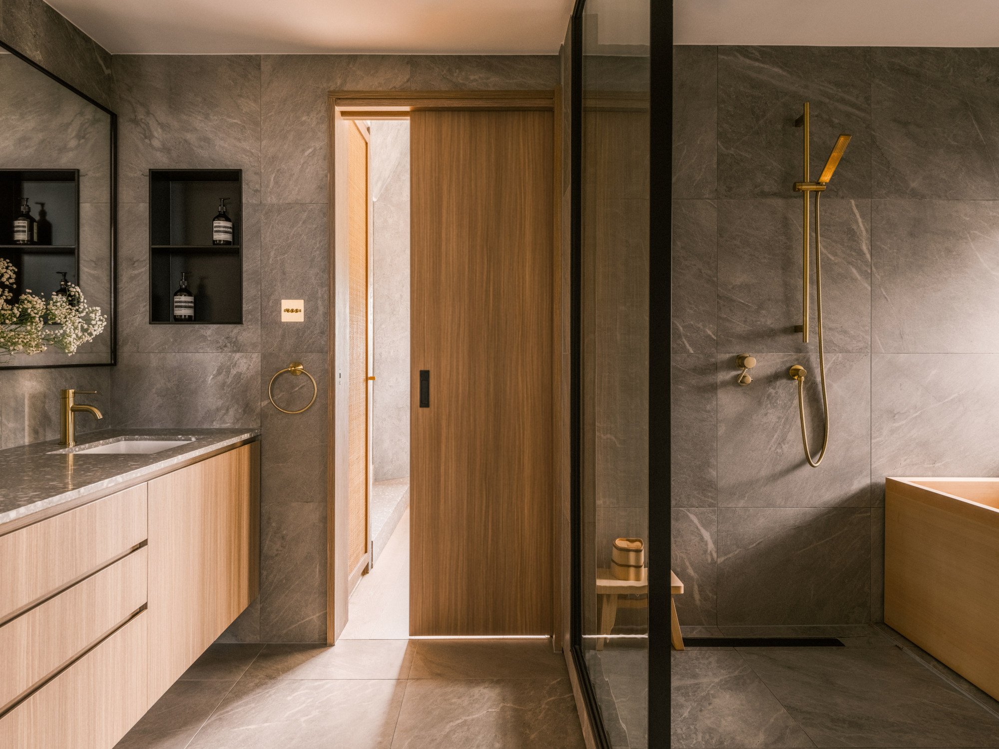
Japanese bathing culture is to the fore in the elegant en suite, replete with an onsen-style wooden tub made from hinoki (cypress), chosen for its warmth and tactility. An open shower completes the luxurious experience in the wet area, which is also equipped with a dedicated double vanity.
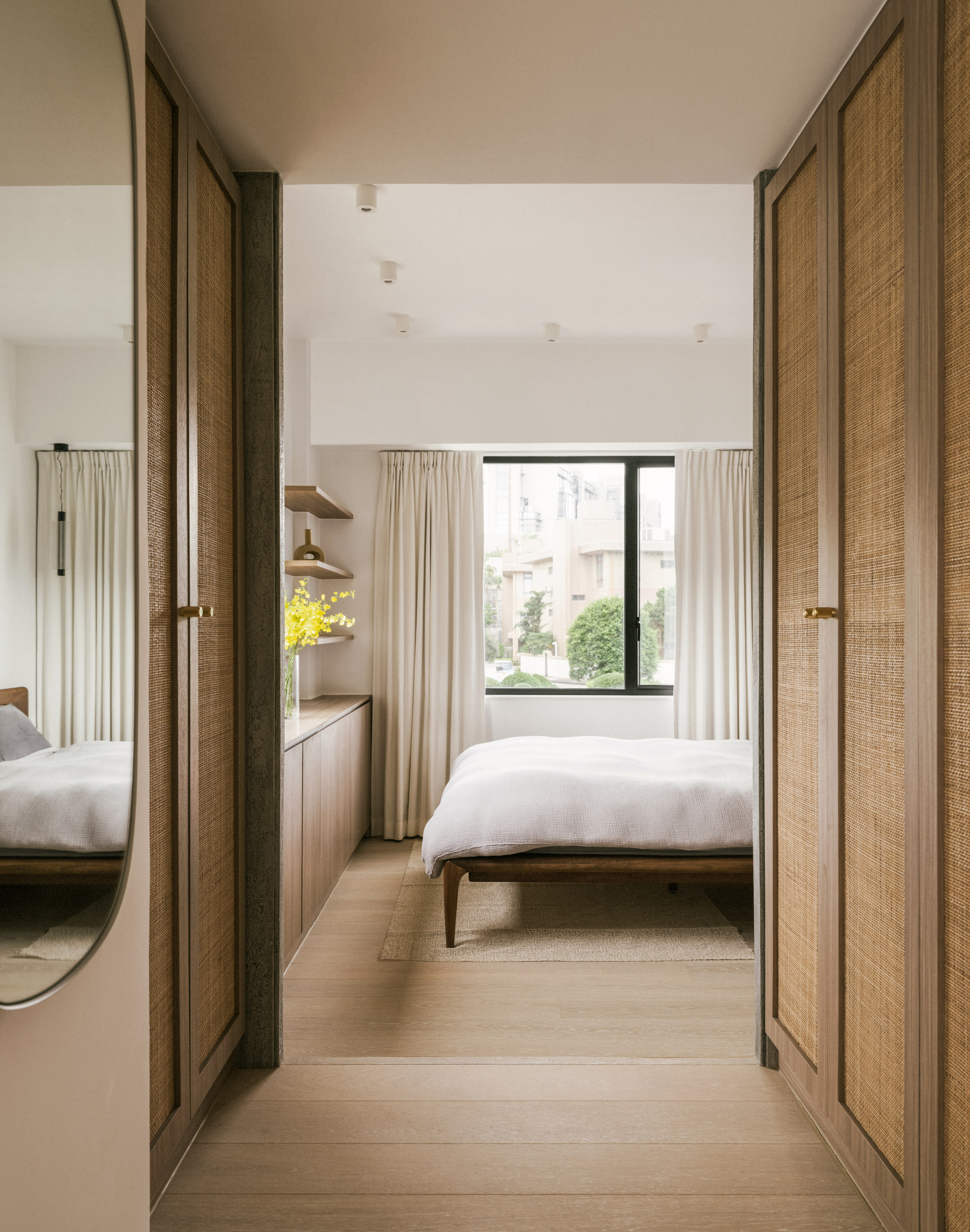
A second portal in the bedroom guides the way to the yoga platform via the timber-framed rattan doors of the walk-in wardrobe.
“It’s about reveals and connections,” Lim says of the portal technique. “You feel like you’re in a space larger than just the bedroom for instance, or the living room.”
Open and airy, tranquil and calm, this apartment has an air of maturity just as the owner had requested.
Living and yoga rooms
Two steps up from the living room, the portal frames the yoga room and the green view beyond. The Offset sofa, by Audo, and the &Tradition Little Petra armchair in sheepskin and white oiled oak came from Wool Studio (woolstudio.co).
The Japanese redwood coffee table was from the client’s previous home. The braided wool rug came from Miss Amara (missamara.com.au) and the Kizu lamp on the plinth from New Works (newworks.dk).
Dining area
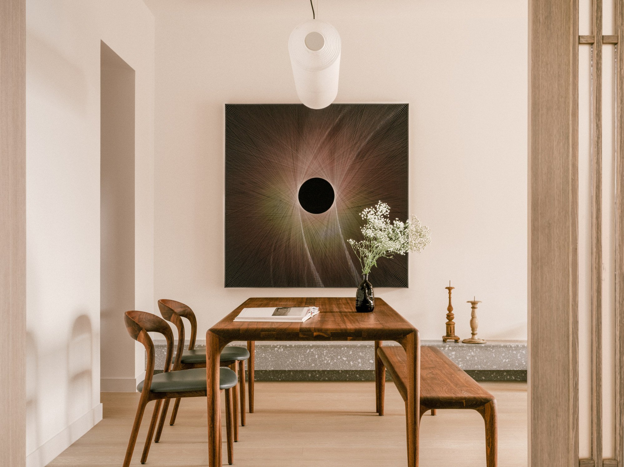
The statement artwork in the dining area is a metal installation by Yang Song, from Aye Gallery (ayegallery.com). The Santa & Cole light fitting made from paper and metal wires was from Wool Studio.
The terrazzo plinth connecting the dining and living areas came from Chun Yan (chunyan.com.hk). The wooden candelabras on the plinth are travel mementos.

Dining area detail
The European walnut dining table, bench and leather-seated chairs, all by Artisan, came from Nature Evolution (natureevolution.com.hk). Engineered oak flooring was supplied by Equal Flooring (equalhk.com).
The slatted timber and frosted acrylic sliding door to the kitchen, a take on a Japanese rice-paper screen, was designed and made by Lim + Lu (limandlu.com).
Bedroom
The timber-framed rattan doors on the walk-in wardrobe frame access to the bedroom, which is one step down. The dressing mirror on the left came from Muuto, and the European walnut Artisan bed from Nature Evolution.
The rug came from the owner’s previous apartment. The cabinetry and shelving, in European oak, were designed and made by Lim + Lu.
Bedroom detail
Above the bed hangs a Metropol pendant from Rakumba, designed by Sebastian Herkner and bought from Archetypal, which was also the source for the Buster + Punch brass handles on the timber and rattan wardrobe doors.
En suite bathroom
In the large en suite, a glass screen delineates the vanity area from the wet zone, comprising a shower and a hinoki (cypress) bathtub from Hinoki Soken in Japan (hinokisoken.jp).
The sink and shower tapware in a brushed-brass finish came from ABI Interiors and the stone-pattern ceramic floor and wall tiles came from Fei Concept. The bathroom cabinetry, in European oak with a grey marble counter top, came from International Marble (intmarble.com). The basin is from Kohler (kohler.com).
Guest powder room
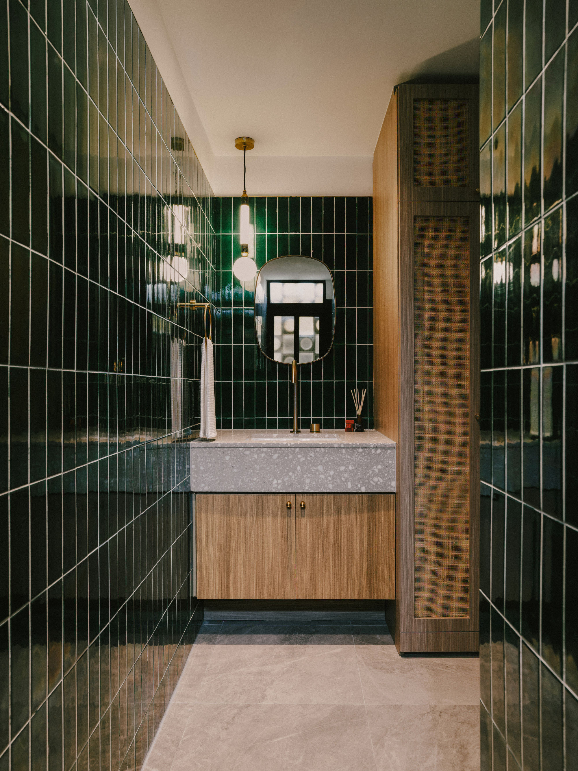
Injecting fun into the guest powder room are forest green wall tiles from Anta Building Materials Supplier (antahk.com). On the floor are stone-patterned porcelain tiles from Fei Concept (165 Lockhart Road, Wan Chai, tel: 2153 3288).
The terrazzo worktop, from Chun Yan, is teamed with brushed-brass tapware and towel rail from ABI Interiors (abiinteriors.com.au), a Muuto mirror (muuto.com) and a Greenstone pendant by Marc Wood Studio bought from Archetypal (archetypal.hk).
Tried + tested
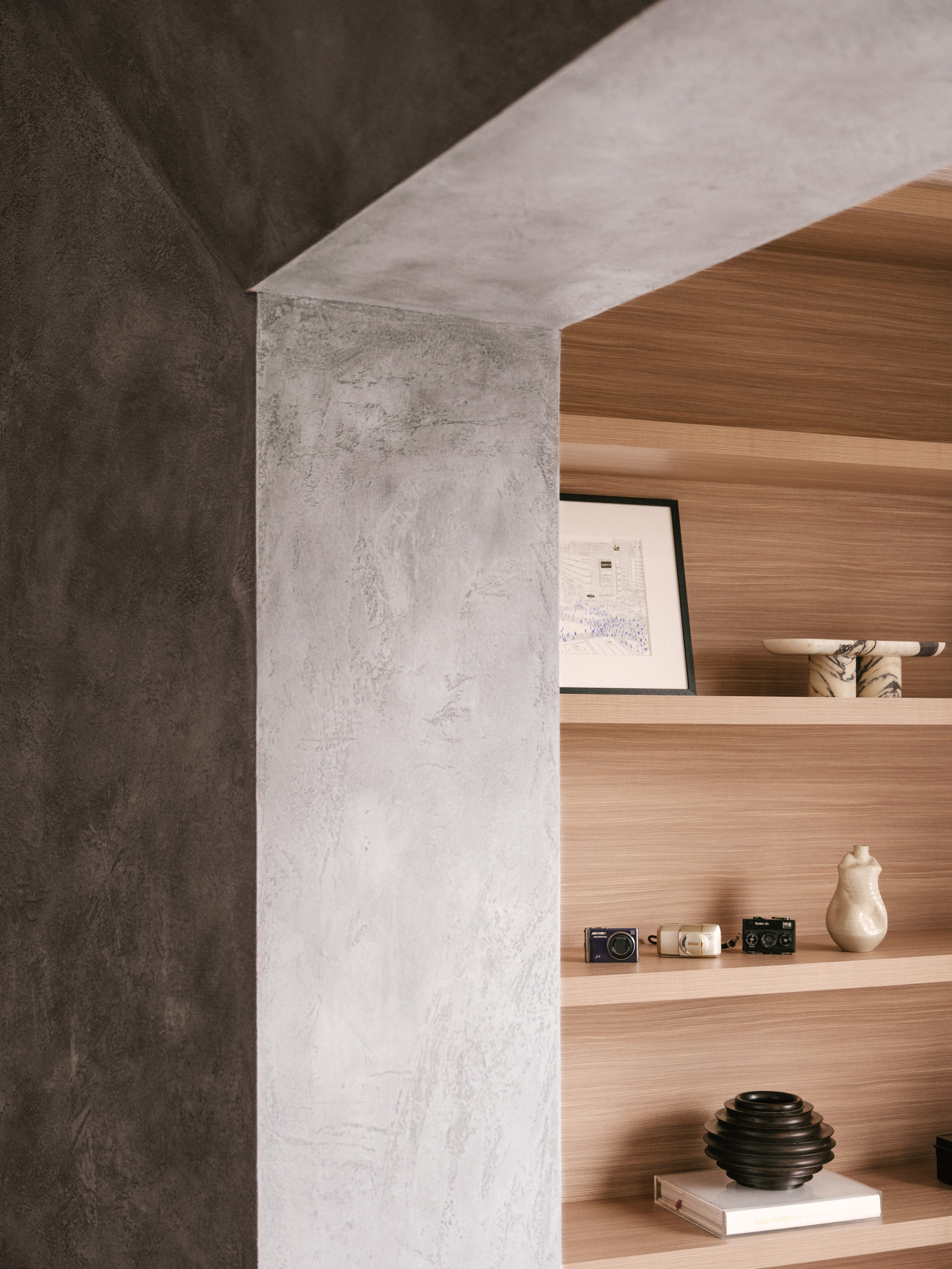
Since ancient times, portals have been used in architecture to herald the importance of what lies beyond. In the interior of this executive apartment on The Peak, portals frame the impressive views of the surrounding greenery and Victoria Harbour beyond the living and yoga rooms, and define the entrance to the walk-in wardrobe.
Because solid concrete would have been too heavy in such a large indoor structure, Lim + Lu (limandlu.com) designed timber formwork to support the 60cm-deep (24-inch-deep) portal, which is finished in concrete-look plaster paint from Novacolor (en.novacolor.it) an Italian brand that specialises in sustainable wall paints and finishes.

