

The iPhone is the best-selling smartphone on the planet and, in the US especially, it’s clearly a dominant force. I’m an Android person by choice, but once in a while, I spend time with the latest iPhone to take a peek inside of Apple’s garden, trying not to get trapped within its walls. Over the past several months, I’ve been using the iPhone 15 Pro off and on and, well, I’ve got thoughts.
The last time I used an iPhone for an extended period of time was with 2017’s iPhone X, the device that really set the stage for Apple’s big evolution of the iPhone. But that was pretty short-lived, as the device was quickly relegated to a few random use cases and checking in on new apps and features from time to time. I’ve continued to happily use dozens of different Android phones over the years since, usually a Pixel or a foldable.
But the iPhone 15 Pro finally piqued my interest enough to fork over $1,000 and give Apple another shot at convincing me.
What the iPhone gets right
Camera, hardware, battery life, and finally, USB-C
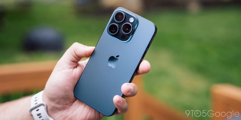
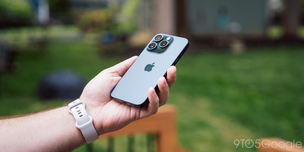
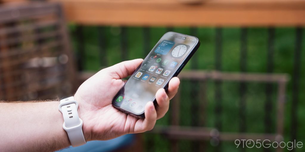
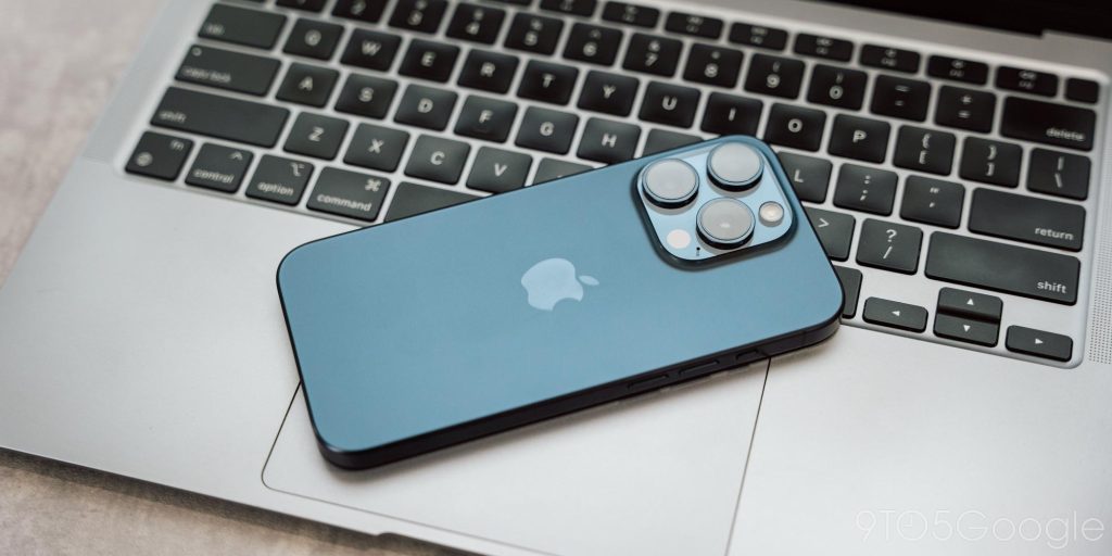
Before we get to the complaints, let’s talk about the good things about the iPhone, and that starts with the hardware. Apple knows how to design a phone, and quite well too. The iPhone 15 Pro’s titanium build is massively overhyped by Apple in advertising, but it’s quite good. The phone feels unexpectedly light, but still very sturdy and premium. I’ve spent most of my time using the device with a Nomad leather case, but any time it’s not in that case is still a delight.
The hardware also has two big highlights to me. For one, I love the color. The blue shade Apple is using here looks great, though I do very much prefer the “Bay” blue color of the Pixel 8 Pro, but Apple’s darker color has its appeal.
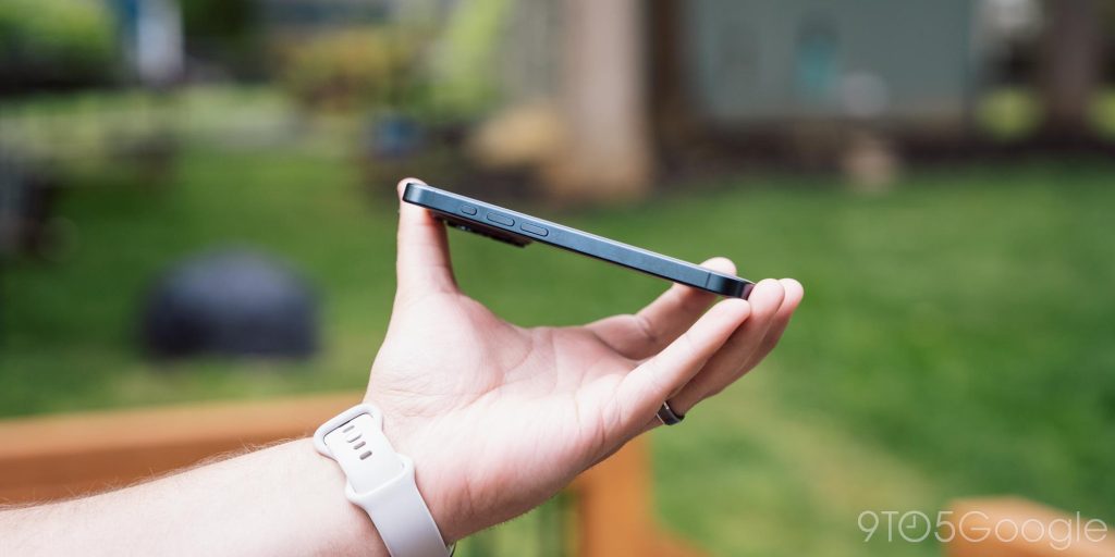
The other big highlight is the size. Android phones of smaller sizes are often sacrificing a lot for their size. The Pixel 8 is a pretty strong offering, but it’s also not quite as small as the iPhone. And, while I’m all for big phones, I’ve really come to appreciate using a smaller device. Now, that usually comes with the asterisk of that main display unfolding to reveal a tablet – the Pixel Fold is especially good in this aspect – but it’s been a delight enjoying a fully powered small smartphone without also throwing away battery life.
And, on that note.
The battery life might be one of the strongest aspects of the iPhone 15 Pro. For its size, it’s impressive. I’ve mostly used this device as a secondary carry, but on the many days I’ve run it as my only smartphone, it has done quite well, easily lasting a full day without any battery anxiety, something that my Pixel 8 Pro, despite its bigger size and battery, struggles with. Now, that might be partially because I don’t have a crazy number of apps installed yet, but I’ve still been very pleased.
Plus, this is the iPhone that finally has USB-C!
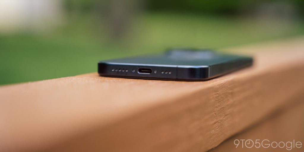
I said several years ago that USB-C is what would get me to give the iPhone another try, and I think this came at the perfect time. Apple may have been forced into it, but the company’s implementation is just what I hoped for – completely neutral. There’s no trickery going on. USB-C, for lack of a better term, just works. My chargers, my accessories, everything works as I expect to. Apple should have done this ages ago, but I’m glad it’s finally here.
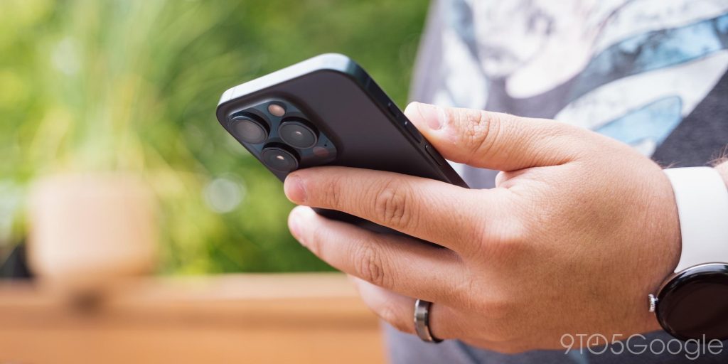
And then there’s the camera. Things have come a long way since the iPhone X I last used.
The iPhone 15 Pro’s triple camera array is consistent and predictable, which is exactly what I want from a smartphone camera. I think, for stills, Apple and Google really hit up against the same wall when it comes to camera quality. For the most part, the “better” photo really just comes down to personal preference. I think I still prefer the Pixel’s contrast-y look overall, but the iPhone’s take on photography is still great. It also works more consistently across apps, somewhere Android really struggles.
Here are a few shots taken on the iPhone 15 Pro over the past few months.
Video is where Apple’s camera experience definitely pulls ahead. While Video Boost on the Pixel 8 Pro gives Apple’s results a run for their money, Apple’s camera records at roughly that quality without hours of cloud processing, and Apple’s support for LOG recording just opens up a world of possibilities. The average customer won’t benefit from that, but the camera here is just great.
That said, let’s get to the fun stuff. The many complaints and headaches.
Let’s talk about iOS
I always knew that my experience with iOS would be full of headaches, but seemingly around every corner was another reason I just dislike the platform. There’s plenty to talk about, but let’s start with the homescreen.
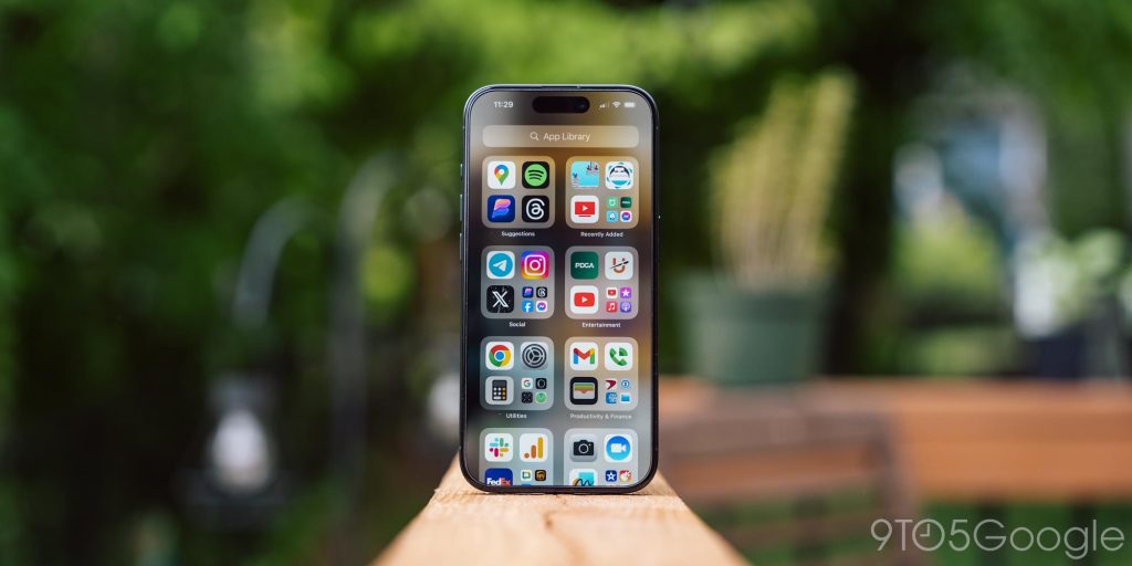
Since the last time I spent time with an iPhone, the homescreen has evolved quite a bit. There are widgets, and the “App Library” too, things I always missed in my past bouts with the platform. Widgets are pretty well done, though to be honest, it’s a feature I’ve moved away from over the years. I barely use it on Android, and I didn’t really find myself using it much on iOS. But at the very least it’s a well-implemented feature and has tons of developer support.
The App Library, though, is just a mess.
The iOS homescreen has always felt messy and unorganized to me just because every single app on your device is forced to be in view. The App Library technically fixes that by giving you the option to remove those apps from the homescreen and dump them somewhere else. But somehow, it just feels worse. iOS automatically organizes your apps in the Library based on categories, but you really don’t have any control, which makes it harder to use. There’s a search function, which is really the only way this has felt useful to me. And it really feels like the only reason this feature is like this is because Apple couldn’t admit it was wrong. The app drawer on Android is a super simply, alphabetical list of your apps available at a quick swipe. It’s intuitive. It’s easy. The App Library is neither of those things. It’s bad.
Since we’re talking about bad things, let’s get around to what was obviously coming.
iOS notifications.
Over the past few months, I’ve come down to the opinon that Apple is purposefully designing iOS to make you forget about notifications, because otherwise, I can’t see how things have come to the point they are today. When you pull down to access Notification Center, iOS only shows you one or two notifications. You have to swipe through to access more, and it often feels like they’re no rhyme or reason to how they show up. The obvious goal is to show things chronologically, but that falls apart if you get a lot of notifications over the course of a day.
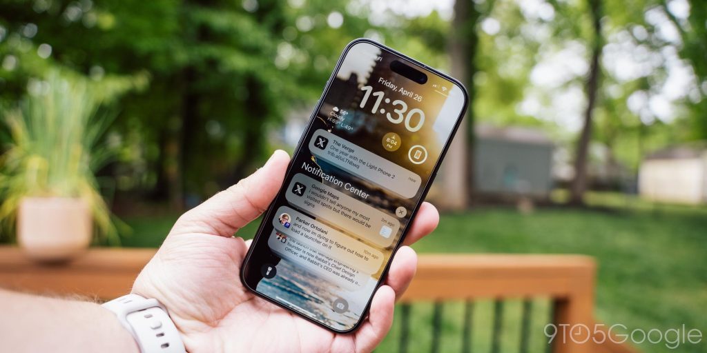
The way in which iOS groups notifications is my biggest issue overall. If you keep up with notifications as they arrive, it’s relatively consistent and easy, but often times I’ll find that if I’ve had my phone in my pocket for a while, I’ll have multiple groups of emails, multiple groups of messages for various apps, and multiple groups of social notifications that are just all mixed between each other. For example, if I get Telegram notifications from multiple group chats, a few Twitter/X notifications, and a few emails over the course of an hour, they might be split into 7 or 8 groups. The chronological approach to notifications makes sense if you’re glued to your phone, but I’m firmly of the opinion that is not how it should work. Personally, I’ve found myself constantly missing notifications as a result of just not being able to see them quickly. And, until I really dig in, I have no idea how many notifications I have. Whether I have a couple of messages and an email, or a dozen apps sending me notices, it all looks the same. And some notifications just never go away until you clear them, even if they’ve been addressed ages ago. Again, this is an area I really feel Android does it better. You can see a handful of notification icons at the top of the screen to quickly get an idea of what’s going on, and the grouping methodology is far, far better.
I think iOS notifications have little to no redeeming qualities, but not every aspect of iOS was so polarizing to me, like the keyboard experience.
I thought smartphone keyboards were something we figured out a long time ago, but every time I move away from Google’s Gboard (on Android), I’m reminded just how crazy things can get.
The stock keyboard on iOS is fine, but I think it gets a little too much praise. The keyboard is great for two-handed typing especially. I think the spacing is really good, and it’s easy to pick up the muscle memory too. Swipe typing, an Android original, is also very well implemented.
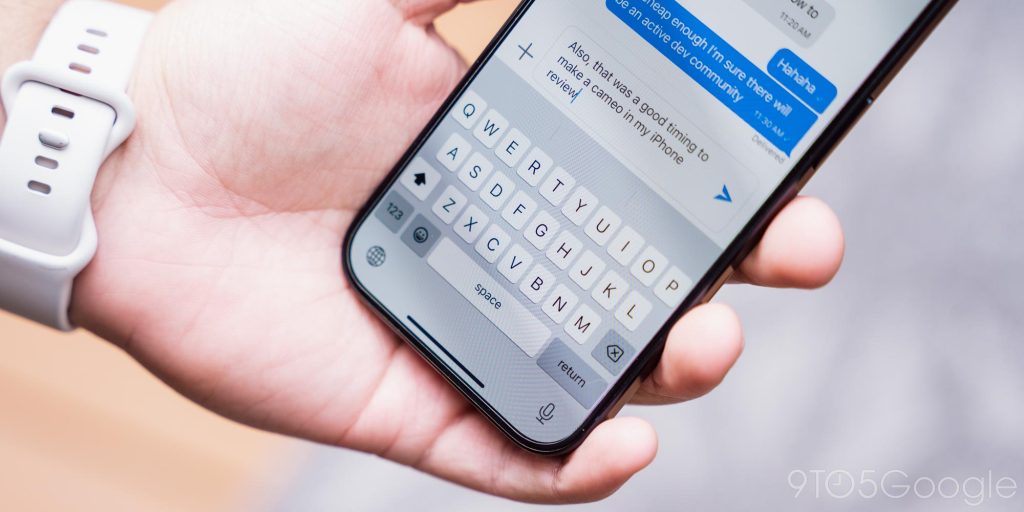
But Apple’s autocorrect is way beyond aggressive, and genuinely a pain to deal with.
Autocorrect is something everyone needs, but there’s a line you have to walk. With autocorrect in Apple’s default keyboard, the whole system just feels like it won’t admit when it is wrong (much like Apple itself). You can make the same correction three or four times, and it’s not going to get the point and just keep making the same correction. Beyond that, and my biggest gripe, is that autocorrect will kick in even after you’ve hit send. If you’re looking at a finished message and hit the send button, if the keyboard feels there’s a correction to be made on that last word, it will do it as you hit send. This leads to frustrating edits after the fact (if that’s an option) far too often.
Voice-to-text is similarly annoying. Sometimes it can work wonderfully, and almost match the Pixel, which is the current gold standard for voice-to-text today. But, other times, it just goes off the rails, though not nearly as much as Samsung’s truly awful voice-to-text.
There are also just features and options missing. It blows my mind that Apple’s default keyboard doesn’t support GIF insertion, there’s no way to show a number row, and I hate that there’s no way to minimize the keyboard without tapping in the app above it.
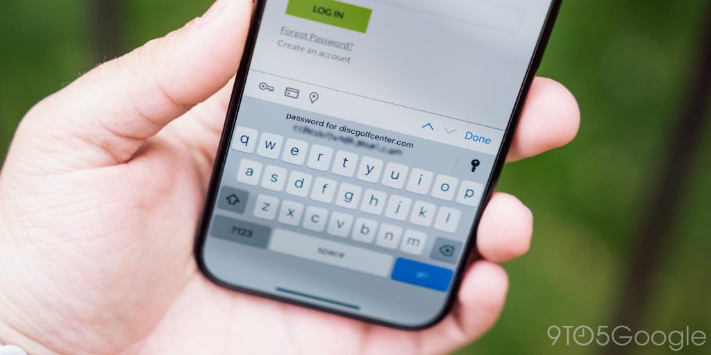
iOS does, thankfully, support switching out the keyboard, but I’ve not found any that I actually like. Gboard, my go-to on Android, feels like a shell of its true self on iOS, with a layout that’s not as good and GIF insertion that’s nowhere near as seamless (which, of course, is iOS’ fault). If there’s one thing the keyboard really gets right, it’s autofill. Where Android’s autofill option is messy and inconsistent (a rant I intend to have another day), iOS autofill is fast and reliable, even with third-party apps like 1Password.
Easily the most annoying part of using iOS after years on Android is the lack of a back button. This logical part of the operating system feels so crucial, unless you’re Apple apparently.
iOS has been designed around not having a system-wide back button for years, so apps are well-stocked with built-in back buttons. In most cases, there’s also a back gesture when you swipe (only) from the left side of the screen. Generally speaking, the lack of a back button isn’t a problem, but it’s an inconvenience.
So many times I’ve been in apps that don’t have a back button in certain UIs, leaving me stuck in that screen unless I move forward. Sometimes, crazy enough, people change their minds. But Apple leaves the task on developers to build this backtracking into their apps, and it’s just not always there. One example of this is the app UDisc, for tracking disc golf rounds. When I’m in a scorecard, there’s no way for me to go back to the rest of the app without closing the app or “finishing” my card. On Android, all I have to do is hit the back button, but since that’s not an option on iOS, I’m just stuck until the round is over. Now, I’m sure the reaction to this will be “the developer should have added a back button,” and technically, you’re right. But why is the task on them?
Why can’t iOS have a back button? I’ve never really understood arguments against it. To me, it just seems like a logical, useful function, and it’s crazy that in 2024 it’s still not a thing.
Android and iOS are both incredibly mature operating systems that know what they do, and do not want to be. As such, when new features arrive in either, they’re very often inspired by the other.
Through my use of the iPhone 15 Pro, I’ve come across things I want Android to have, but there’s a ton I want from Android to be available over on iOS. And, ultimately, it just feels like Apple doesn’t want to admit Android did something better. When that does happen, Apple just comes up with the most convoluted way to do the thing just to avoid admitting Android was right. The best example of this is the App Library which, as mentioned, is just a mess, but this just feels like an overarching theme of a lot of Apple’s recent, overdue feature additions.
Of course, there’s a lot to be said about Android copying iOS features too. Samsung and others have been pretty shameless about this over the years, but in a way, that’s a good thing. These Android brands aren’t really afraid to look at a feature Apple has introduced and say “hey, that’s a good idea.”
And, yes, there are quite a lot of those good ideas in the software too.
One thing I’ve quite liked has been the ability to rotate through lockscreens quickly. The presets are useful and extremely well-implemented. I also love having lockscreen widgets, something that Android never should have thrown away.
Apps are, of course, also a big highlight of iOS. The overall bar for quality seems at least a couple notches higher on iOS than it does on Android, but only if you decide to dive into apps that are iOS-only. If you live a cross-platform life, like I do, apps on iOS feels equal to their Android counterparts for the large majority. Ironically, it’s Google apps that feel the most behind on iOS. Something that I did very much enjoy was the App Store, if only for the impossibly fast app installs that feel instant compared to Android’s often slow process.
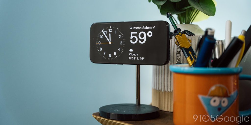
StandBy is another standout for me. Combined with MagSafe docks, it supercharges the always-on display with big clocks, weather notifications, and more. It’s been super useful at my desk. My Pixel does something similar with the Pixel Stand, but Apple’s implementation is better in my opinion, as I don’t always want to use this. Being able to have it readily available by simply rotating the device is brilliant!
Then, of course, we’ve also got to talk about the “ecosystem.”
This is a pitch that’s never really appealed to me, because I try to live my tech life as “platform-agnostic” as possible. Apps that don’t work across devices just do not earn their place in my workflow. That’s why Apple’s approach to apps and services just doesn’t appeal to me, and why Google’s do.
But even I’ve got to admit there are some delightful little touches throughout the ecosystem.
For instance, I just picked up a MacBook Air after years of being fed up with awful battery life on Windows laptops (fingers are crossed hard for Snapdragon X Elite), and the speed at which the MacBook can trigger a hotspot on my iPhone is wonderful. It’s really handy for on-the-go work, and made the switch from my LTE-connected HP Dragonfly Chromebook way less painful. This isn’t some outlandish idea, and you can do the same between Android phones and ChromeOS, and even some Windows laptops, but it works really well here.
Similarly, connecting the iPhone to a MacBook webcam can be borderline magical (if slightly tedious without accessories), and better than what Android currently offers. And, on a similar MacBook note, I really like getting notifications on the iPhone when I leave the Mac behind through the Find My app.
On that note, I’ve also really enjoyed AirTags. This is something that I’ll finally be getting on Android soon now that the Find My Device network is live, but I’ll be impressed if it matches the same seamless level of integration as the AirTag has so far. One thing Android will definitely be missing is UWB, as AirTag supports it, but none of the Android trackers do. I also applaud Apple for putting the same UWB hardware in this smaller iPhone 15 Pro as it does in larger models, while most Android manufacturers skip UWB on anything but their top-tier flagships. That’s a short-sighted move.
There’s also Apple Wallet, which is superior to Google Wallet. Admittedly, I didn’t use this a lot as the iPhone spent most of its time as my secondary device, but it integrates better with cards – it’s super convenient to see my full AMEX transaction history versus just what happened with Apple Pay – and works with far more passes. Swapping cards via a double tap of the power button is also super useful (though I’d rather have a camera shortcut there).
Siri Shortcuts are another thing that impressed me. I didn’t dive into this functionality too far, but I think it’s crazy just how much you can do with Shortcuts, and crazy that Android doesn’t have anything remotely similar. My colleague Damien Wilde loves this features especially.
Then, there’s iMessage.
iMessage is severely overrated.
It’s a good messaging app, but it’s no better than any other modern messaging app, and all of those don’t require people to buy a specific smartphone just to use it. I’ve said my piece on iMessage before, and six months on an iPhone hasn’t changed anything.
Use other messaging apps people, please.
In the end, I think iOS is a completely fine and very well-built operating system. It has all of the features you need, a lot of helpful tricks, and an interface that’s fairly easy to understand, even if I think some things (like notifications) are unintuitive.
I just don’t like it.
I love being able to have my homescreen just the way I want it. I love having the ability to manually sideload app updates. But more than anything, I just prefer the way Android, specifically on a Pixel, works. And that’s okay. Everyone is allowed to have their opinions. If you like iOS, that’s great!
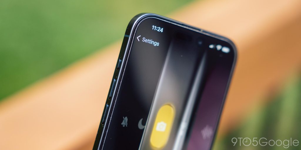
The Action Button was wasted
One of the new things to iOS on the iPhone 15 Pro is the “Action Button.” It’s a pretty wild new idea for the world of iOS. A customizable button that you can choose what it does. It replaces the mute switch, and as such defaults to replacing that functionality.
It probably should have stayed that way.
The Action Button is a good idea inherently, but it has some key flaws. First and foremost is the requirement to press and hold the button to do anything. My first thought for this button was to assign it to open the camera, as iPhone lacks the double-tab gesture for accessing the camera quickly via the power button. But the press-and-hold gesture takes too long and just ends up feeling more cumbersome.
Where Apple really could have made this feature shine was in giving users three actions. One with a single tap, one with a double-tap, and a third with the current press-and-hold. Even if just the latter two were available, it’d be significantly more useful than it is today.
Right now, the best function for the Action Button is to use a Siri Shortcut menu. This lets you pick and choose from several functions. I think it’s still a little cumbersome because of the time required for the button to be pressed, and because of the button’s high placement, but it’s still useful functionality.
The iPhone isn’t for me, but it’s still the smartphone to beat
Just because the iPhone isn’t for me, though, doesn’t mean there aren’t good reasons for millions upon millions of people to buy it. Apple has an inherently fantastic product here, and it’s absolutely the gold standard of the smartphone industry today.
At the end of the day, it’s hard to beat the iPhone’s value proposition. The $999 iPhone 15 Pro I’m using has cutting-edge processing power under the hood that will “future-proof” it for years to come. It has more camera functionality than most Android phones. It has stable software that will be updated for several years. And it has exclusive features that Android doesn’t.
Apple has built a good product that people should love. Every Android flagship gets measured up to the iPhone, and for good reason.
The iPhone is very, very good, as long as you actually like using it. It’s just not for me.
Where to buy iPhone 15 Pro
FTC: We use income earning auto affiliate links. More.