
I’m a longtime Google Maps user, even I have trouble navigating the app sometimes. It’s not about Google’s massive redesign from last year that angered most people. I’m fine with the new colors and wouldn’t switch back to the previous palette. This actually proves that we can easily adapt to app user interfaces, and we do it quickly even if the changes seem scary.
What I don’t like is how I constantly have to pull up and down to open menus and glance at information while I’m navigating. I do that all the time while walking or using public transit, and it’s even worse while driving. I sometimes get lost in the menus and forget what I was looking for.
That’s even more annoying if you’re dealing with a brand new city that you have to navigate to get to a specific destination quickly. I don’t even want to think how difficult it must be to navigate Google Maps if you’re a less tech-savvy user.
A few months ago, Google gave us a brief look at what the new Google Maps UI could be. The app might do away with full-screen menus and provide more contextual information about where you are on the map. It could also show more of the map rather than clutter the navigation panel with other UI elements.
Here’s what the redesign teaser looked like back in early February:
It turns out that Google hasn’t abandoned the UI changes, and that’s great news. Instead, Google has been tweaking the design changes, and it’s now offering an early look look at the redesign.
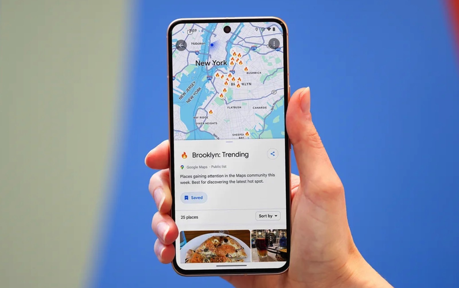
After discovering the initial UI design test in February, 9to5Google says Google pulled it from Android devices after a few weeks. But Google is now back with a similar Google Maps design test that builds on the previous version. The full-screen information sheets are now replaced with panels that have rounded corners and do not take up the entire display. You can still see the map at the top, which makes in-app navigation easier than before.
Google also placed simple “X” buttons on the information sheets that tell you how to close a panel to focus on the map.
Speaking of the maps, when the information sheets are minimized, you see more of the map and any navigation suggestions you might have. That’s a great upgrade, at least for me. While I’m using Google Maps to discover places around me, I still need it for navigating more than anything else.
After traveling for a couple of weeks and using Google Maps extensively to find stores, places to eat, hotels, and getting help with public transportation, I can safely say I definitely would have appreciated the redesign. It’s much cleaner than the current UI, and it’ll make finding your way around the Google Maps app a lot easier.
As always with unreleased Google Maps features, nothing is final for now. Google is still testing the redesign, and the new UI is only available on Android after you get on version 11.127.x. That assumes Google makes it available in your area or on your device. As an iPhone user, I don’t have access to any of that.
However, once Google is happy with the new UI, it’ll be available on Androids and iPhones. You can see the new design changes more closely by following this link, as 9to5Google captured plenty of screenshots highlighting the changes.